Wednesday, March 31, 2010

Through the Looking Glass


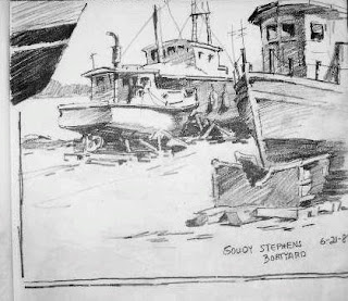
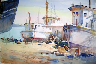
Yesterday I spoke of locating source material to develop into paintings. Here is a sketch I found in one of my many sketchbooks, and the painting that resulted.


To give the feeling of being in the boatyard among the boats, I used boats on either side of the composition as framing devices. The one on the right leads the viewer into the painting, and the hull on the left stops the eye and keeps it on the focal area.


The dark cast shadows under the boats form a broken line which is always more intriguing than an unbroken straight line. Even in such a small shape, I keep in mind interlocking shapes. It has the advantage of implying all sorts of debris without having to detail the interior of the shape.


You may also want to study the many shapes that feature gradation of value and even subtle color changes.


Monday, March 29, 2010

Rumaging for Subject Matter


While looking through some of my old sketchbooks for something to paint, I came across this sketch of Stormy, the long-time engineer of the St. Louis Zoo train. Later I found a pastel that I had done from the sketch.


Not only does a sketchbook provide memories of a particular day or experience, it can provide you with subject ideas for paintings down the road.

I have a filing system for old photos, too. "Boats", "Architecture," "Farms," "Animals," "Trees," "Docks," etc. Sometimes I use one photo for the main subject and another photo for background material.

I also collect postcards of places I've visited. Be careful with this one; copying a composition is considered plagiarism. I use them primarily for one item in the picture: a building, figures, mountain shapes.

When I travel, I also look in antique stores for interesting items to include in still life paintings.

But the sketchbook is the thing. It is my own take on a scene or object that I had a reaction to and that is in my own "handwriting". My sketchbook is always in my car, along with a little makeup bag filled with pencils, markers, charcoal, and conte crayons.
When I am unable to get outdoors to paint on location, rumaging through these sources is a good way to get my creative juices flowing.

Sunday, March 28, 2010

Tree Clusters and Contrasts


One more entry on trees. In this scene, I was most interested in the clusters of trees, in particular the angular branches of the trees on the island. There, texture also becomes important, whereas the background trees become one continuous shape with no interior textures.


The other consideration was contrasting the color in the sky with the tree colors. By choosing a pinkish tint in the sky, I set up the complementary colors of red and green.


When setting out to paint trees, rather than thinking, "I am going to paint trees", I think, "I am going to paint interesting shapes with contrasting colors, values, and textures."

Friday, March 26, 2010

Tree T


Way back in one of my earlier entries, I spoke of the T as a compositional device. In this painting of a tree next to a stone wall in New England, the upside down T works to emphasize both subjects. Gradation in the wall shape, the trunk and the background shape helps lead to the focal area.


Notice, too, how the background trees are reduced to mere silhouettes in lighter and lighter values. This aids in subordinating them to the "star" tree.


Be careful as well not to outline rocks, bricks and stones. Paint their base color and then pick out the dark cast shadows.

Wednesday, March 24, 2010

For the Love of Trees


In one of my past lives, I must have been a Druid. I love being in the same space with trees.
The reflective calm that comes over me in a forest is hard to match in any other setting.


Once in one of my English classes, some students asked if I believed in heaven. I answered, "All I know is that if there aren't any trees there, I ain't goin'!" I'm sure the more literal ones among them were greatly concerned for my immortal destination, but I was trying to make a point about serenity and beauty.


" I think that I shall never see/ A poem lovely as a tree" may be corny poetry, but it certainly speaks to the power of trees to soothe the savage breast.


P. S. Sadly, this spot no longer exists. Some fool bought the land and bull-dozed the entire forest so he could build a starter castle that he uses a couple of months a year. Now whose soul should we worry about?

Monday, March 22, 2010

Tree Portraits


I love trees! Once in a while you'll find a tree that deserves to have its portrait done. I found this beauty in Apalachicola, Florida. It's in the front of a dentist's office, so when a woman stopped by to watch me paint, and she said, "Oh! You're painting the Doctor's Tree", I assumed she meant the dentist. "Oh, no," she said. "Back in the '20's, there was an old doc who took a dislike to this tree for some reason, and every time he got drunk, he would ram his Model T into the trunk!" I guess not everybody loves trees like I do.


Not only did I love the beautiful curves and angles of the branches of this live oak, but I liked the Resurrection Fern growing on the top of one of them. Resurrection Ferns can look like they've completely dried up and turned brown, but with the first sign of a shower, they rise up green as they can be. Come to think of it, a little like a frustrated painter!

Thursday, March 18, 2010

More Interlocking Shapes and Silhouettes


In this painting of the town square in Franklin, Tennessee, just south of Nashville, I was again very aware of the shape of the background buildings, which also determined the shape of the sky. The silhouette of the buildings interlocked with the sky in jig-saw style. I must confess to moving a few things in order to keep the roof line on the left side from being a boring straight line with no interrruptions, and therefore, no interlocking shape.


Also note that the colors and values run from warm darks in the foreground to cool lights in the distance to instill a feeling of receding objects. Without over-defining each separate building, the colors and shapes do the lion's share of the work. Overlapping the monument using small shapes of darks further accentuates the foreground and provides an aerial perspective to complement the linear perspective.


Silhouettes and gradation come in aid of an interesting shape. It doesn't take millions of details to give the feeling of a small city landscape. It just takes good solid values that overlap.

Tuesday, March 16, 2010

Backgrounds--Trees


A couple of entries ago, I spoke about the scariest color: red. But greens are also a trouble spot for many landscape painters.


One reason that greens are problematic is that it is so easy to end up with a dull, uniform muddy color. When painting a group of background trees, try to slip some warm and cool colors into the shape.


Also, don't forget that treelines in the distance interlock with the sky shape, so beware of the tree top lines so they don't become a straight line.


And finally, consider the possibility that the trees in the background don't come in aid of your painting. The greens may clash with the foreground colors or the values may box in the foreground shapes.


I painted this scene on location in New London, New Hampshire. After a couple of years of including the background trees and being frustrated with the result, I decided to omit them altogether. So this lesson on background trees is that in some cases it's better to just leave them out!

Saturday, March 13, 2010

Interlocking Shapes


One of the puzzling things for many beginning artists is what to do with the background. When they describe the problem to me, it seems they are more concerned about what to include in it or what colors to make it. I am more focused on making sure that the background shape interlocks with the foreground shape and that those shapes are interesting.

Interlocking shapes are like pieces of a jigsaw puzzle. They fit into each other. An example of two shapes not interlocking is a painting of the sky and the ocean meeting at an absolutely unbroken horizon line. The resulting two shapes would probably be two rectangles...very static and boring shapes.

Look for ways to break into any static lines to form shapes that interlock with each other.

In this painting of a tugboat (which is actually a restaurant in Boothbay Harbor), trace the outline of the tugboat with its stacks and the roofline, and you'll see that the background and sky also become a more interesting light shape.

Thursday, March 11, 2010

The Scariest Color


Of all the colors on my palette, red is the one that scares me the most. It is very aggressive and cannot be ignored. Even a small spot of red will draw the eye.


But red is a prominant color in Chinese ornamental architecture. In this scene of Chinatown, it appeared in most of the buildings. I decided to keep the entire painting in a warm color scheme, so I used orange in the underpainting, and since blue is its complement, threw in a bit of that as well.


The busy street scene needed lots of smaller shapes near the center to emphasize the activity. The banners and figures supply movement.


The purplish shadows share the red hue which is therefore compatible with the local color.


Don't shy away from colors that you normally avoid. Swing away with a loaded brush and see what happens!

Wednesday, March 10, 2010

The Art of Elimination


I love to paint on location but sometimes there is too much subject matter to include in one painting.
So how do we choose what to include and what to eliminate from our paintings?


1. Name the one subject that you want the viewer to focus on.
2. Name the area on the painting surface that you want to zero in on.


3. Think of textures in the background that can be eliminated.


4. Decide which background objects don't add to the focal area.


5. Choose some dominant colors, and subtract objects that don't fit the color scheme.

6. Or....Change the color of those objects.


7. Make the focal object fit into its surroundings.


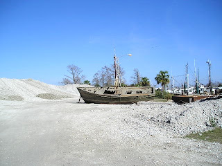
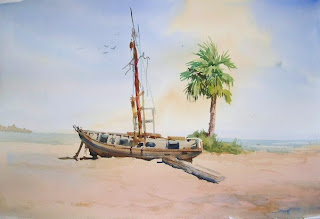
I'm including the photo of the derelict that I painted on location so you can see the stuff I chose to eliminate. It seemed to me that a derelict should be in an isolated location, so I took out everything but the old boat and one palm tree.
When composing, eliminate anything that doesn't support the main actor!


Tuesday, March 9, 2010

A Local Sight


This is a local tradition----the Vegetable Boat. It makes the rounds of the islands around Boothbay Harbor, bringing fresh produce to islanders who must plan their mainland grocery visits carefully. The low sleek lines of this vessel appeal to me. So do the bushels of fiddleheads and other seasonal vegetables.


I'm back to painting after a long cold, rainy winter that prevented much outdoor painting.


I hope to share some new work with you very soon.

Sunday, March 7, 2010

Drawing


The day Ed Whitney taught his last class at the Pratt Institute, he left his students a simple message. High on the wall in huge letters he wrote the word DRAW. Then he drew a line down the wall, along the floor and up the opposite wall where he wrote: "Goodbye. Good Luck."


Whitney was a fine watercolorist and excellent painting instructor. The fact that he emphasized the importance of drawing in his last message to his students should drive home to all of us the need to constantly practice this most basic of artistic expressions.


A friend of mine is currently undergoing training to become a volunteer docent at the St. Louis Zoo, and it reminded me of some drawings I did there a while back. I remember everything about these days. Drawing and painting seem to heighten awareness of your surroundings, and intensify all five senses. So carry your sketchbook and become a sketch hunter.

Friday, March 5, 2010

Growth


I always tell students to save their old work in order to monitor their progress and growth. Changes in style, color choice, and looseness can readily be seen over a number of years.


If there is little change, that would also be informative.


Change for change's sake or a sudden style change chosen merely to impress critics or gallery owners can be seen not as an effort to explore possibilities, but rather as a strategy to garner attention. Better to evolve by studying your work and finding some aspect of it that you would like to push, to develop, to emphasize.


Here are two examples of my work. One is from twenty years ago, the other from last summer.


I have gradually decided not to slavishly replicate the colors of nature, but to choose a palette of brighter, purer colors. I think it's fairly obvious that I've also loosened up quite a bit. Edge quality has changed as well.


Anything else?

Thursday, March 4, 2010

Escape Routes


I also refer to this technique as "leaky light." The idea is to not box in shapes, but to connect them by letting passages of light flow from one area into another. The flow of light keeps edges from getting too hard, especially at the edges and bottoms of buildings, and also tends to direct the eye around the painting.


In this example, you can trace the path of light throughout the painting.

Wednesday, March 3, 2010

On the Road Again


Up very early to leave Apalachicola. Goodbye to Edda and Sportsman's Lodge and Eastpoint and the Gulf.


Up Hwy. 65. About ten miles south of Hosford, I came face to face with a small herd of long horned cattle ----half along side the road and half in the roadway! I could see the open gate where they had wandered out. Time for a round-up!


One highlight of the trip was the town of Eufala, Alabama. Wonderful Main Street, fountains, lovely old mansions with live oaks shading everything.


And since Alabama and Georgia are peanut states, this cute little sculpture celebrating the National Peanut Festival caught my eye at a rest stop just inside the border.


Finally I arrived in Dadeville for an all too brief visit with friends Linda and Monty. Linda drove with me up here to Alexander City and Monty joined us later for dinner at Ruby Tuesday. I'll see them again in July in Boothbay Harbor.
So no painting today. I'll be back home Friday afternoon, so revisit my blogsite after then!