Sunday, January 31, 2010

From Sketch to Painting


Keeping a sketchbook handy is a habit that can aid the painting process. It's the place where I work out many of the kinks before I get my brushes out. Sketching is like brainstorming. Values, placement, size, lighting, and elimination of unnecessary elements are worked out ahead of time.


A sketch is not a drawing. Drawing strives for accuracy of line and many times details that don't necessarily involve compositional considerations. A sketch is looser and freer than a drawing and is not concerned with being a finished work of art. It is a plan of action.


Here is the sketch and the resulting painting of the lighthouse in Rockland, Maine.


Thursday, January 28, 2010

Painting Through


I love to paint the shrimp boats over at Scipio Creek where the fleet is harbored. The booms, wires, gears and nets that form a lacy pattern against the lighter background attracts my eye every time. Today I painted the building which houses the estuary research facility.
When painting the sky, paint through any areas that will eventually be darker. (The exception is if that midtone is going to be warmer and you don't want it influenced by the cool sky tones.)


When painting a midtone shape, be aware of subtle color changes and creating an interesting shape. Paint through all the areas that will eventually be darker. For instance, the building was once all one value. When it was dry, I came back in with the darker shadows. These darks must be bold enough so you don't have to go back over them again. Paint through all the rigging that will eventually be even darker. Find the major struts and bars that do the hauling, and you can then be a little more flexible and inventive with the rest of the lines and wires. Then load the brush with lots of paint and little water to make the darkest lines in the composition.


Paint through areas that will eventually be darker. Don't stop at the line where a darker shape will be or you'll get a halo effect that will look unnatural. Knowing ahead of time where your lights, midtones and darks will be will allows you to paint through those areas that will later be darks.

Wednesday, January 27, 2010

Apalachicola


I've been in Apalachicola for over four weeks but it's been so windy, cold, rainy and foggy, that not many paintings have gotten done. Yesterday I tried to paint in a fierce wind, and the easel kept threatening to blow over so I spent more time grabbing for it than I did painting!


But today was sunny and nearly windless. I decided to try a street scene so you could see one of the main corners in the historic little town. The building in the distance is an old armory. I simplified its shape to a silhouette, and then overlapped it with the darker shapes of the foreground buildings. Figures help make it look like it's not a ghost town.


See shapes before you see details within the shape. Keep any details in the distance to a minimum. The viewer, who is not standing in front of the scene, will not miss them.

Monday, January 25, 2010

Re-Interpreting an Old Subject


Here's one last painting in the Wharf Life Series. This time the focus shifts to the area under the pier. I even invented a floating dock that wasn't there. Again strong color plays an important role and there is an overall checkerboard pattern. I'm also including the first painting in the series to show the evolution in style.

Saturday, January 23, 2010

Re-Interpreting an Old Subject


First of all, let me say I apologize for not posting for a while. I haven't gotten a signal here at the lodge for a few days. I hope the problem is solved.


Here's another version of the same subject I spoke of last time. This time it is color rather than overlapping that was my focus. Painting a gray building is a challenge that can sometimes be overcome by splashing on the color. In this version I let the oil tank's color define it as a focal point.


Imaginary color is a device that lends needed interest and drama to an otherwise low key subject.

Thursday, January 21, 2010

Overlapping Shapes


For the next few posts, I would like to show you how you can re-interpret an old subject. One of my favorite painting spots is on the eastside of Boothbay Harbor. I like the subject--an old cluttered wharf--and there's plenty of parking on the cement dock where I set up my easel. Plus, this is a spot that very few tourists find, thus allowing me uninterrupted painting.


The buildings on most docks are a rather boring shape---a rectangle. One way to tackle this problem is by using overlapping objects to break into the static shape (the oil tank). Another is by connecting the shape to other objects (the crates, figure and barrels).


A circle is also a boring shape, so I found a way to interrupt the the end of the oil tank shape with an overlap.


To avoid a straight line where the pilings meet the water, I added a rowboat and some reflections, and angled the foreground.


Overlaps provide depth, but they can also break into a shape with little or no interest.

Monday, January 18, 2010

The Frame


Yesterday I spoke of placing an object in the foreground to frame a subject. Sometimes though, the frame becomes the subect.


In this painting of The Trees of Ocean Point, the lighthouse in the background is almost incidental, more of a balancing element than a focal point. The real subject is the twisted tree trunk with its shadows and foliage.


Yesterday's frame existed on only one side of the composition. In this painting the frame is on three sides of the painting. The second tree group is an eye-stopper to keep the viewer from wandering off the paper.


Also, examine the major trunk to see the multiple colors and gradations that give it more interest than painting a solid brown or gray trunk.

Sunday, January 17, 2010

Framing


No, I'm not talking about putting a mat and frame on your watercolor. A very old compositional technique is to place an object in the foreground to look past or around at the focal point. The foreground object acts as a frame around the primary subject.

This scene is right outside my window here in Eastpoint looking down the Apalachicola River Basin. The palm tree in the foreground serves to frame the dock. Right now those palm fronds are blowing in the stiff breeze coming off the estuary.

In photography and painting, peeking around the corner helps to give a context for the subject as well as keeping the eye in the picture area.

Thursday, January 14, 2010

The Not-So-Pretty Subject


Who knows why some artists are attracted to one subject more than another. Some paint wildlife exclusively while others paint mountain scenes. Some are interested in the human figure, while others are compelled to paint flowers. This painting causes me to wonder why I am so drawn to old, weathered, dilapidated waterfronts.


Maybe it's the work being done there. Or maybe it's the feeling of down to earth history. It could be the textures, the rough way of making a living. But the pull is strong.


In this painting of Water Street along the working waterfront in Apalachicola, the subject matter demanded lots of textures and an absence of strong colors. I used just a spot of rusty color to break up the grays and blacks of the warehouses. Study the underpainting by looking at the ladder and you'll see that I started with burnt sienna and faded to blue/gray. Then I painted the negative space to pop out the ladder.


The design is basically an upside down T. Lots of obliques give the feeling of some movement in a very static scene. Despite its deserted look, I wanted the painting to suggest that there is still life going on here.


Tuesday, January 12, 2010

Many Happy Returns


This is one of my favorite painting locations in Boothbay Harbor, Maine. You never know what kind of vessel will be tied up to this dock, waiting to get up on the ways for repairs at Sample's Shipyard.

Returning to a favorite location can be a way to get through a painter's block. I love to paint boats, and I feel comfortable painting them. One of the best ways I've found to get back in the groove and keep your hand hot is to paint something you are totally familiar with, something you've been successful at painting before. It can also be a choice when trying to break through to something new. Familiarity can provide comfort, but it can also produce boredom, causing experimentation.

So whether you're trying to feel comfortable or to experiment with something new, try an old location and let the juices flow!

Monday, January 11, 2010

Vignettes


Okay....I'll admit it. I have a bias against flower "portraits". I guess I've just seen too many iris paintings in local art shows. However, here is a painting I did one morning out at Ocean Point of some Rugosa roses (beach roses) and their fruit, the rose hips.

The format is a vignette, which is a shape in the picture field that touches three edges of the paper at different intervals, leaving the rest of the painting as the white of the paper. It requires making the shape interesting so that the negative space will also be interesting.

I also formed a line of the flowers to guide the eye through the painting. It would also work if you painted one flower larger to serve as the focal point.

Saturday, January 9, 2010

Botanicals


Visitors to The Coastal Maine Botanical Garden in Boothbay are treated to a variety of interesting specimens. I found these weeping pines to be almost Disney-esque. I've discovered that when something catches my attention, I should paint it, no matter its probability as a saleable subject. I paint better when I like the subject, and sometimes that includes the unusual. Look around and see what first attracts your eye.
Also, be sure to break up the monotony of greens by sneaking in a bit of the complementary color red---in this case, pink---into the scene, whether it's really there or not.

Thursday, January 7, 2010

A Very Special Friend


Pardon this very personal entry. I'm sitting in a hotel room in Fernandina Beach, Florida, having come here for three days to visit my friend and fellow watercolorist Judi Wagner. Judi is a nationally known watercolor instructor who has lived in Maine during the summertime as long as I have. One of Judi's students has flown in from New Hampshire to join me in this visit. Judi has a serious diagnosis, so we've come to see her and let her know how much she has meant to us over the years. To anyone out there who knows Judi's work or has been her student, I want to tell you that Judi is facing her fate with humor and courage. We have had some good laughs during the last couple of days. But today's goodbye visit will be very difficult for all of us.

We love you, Judi.

Monday, January 4, 2010

Botanicals


The Coastal Maine Botanical Garden in Boothbay, Maine is a wonderful place to stroll, sit, contemplate the beautiful placement of flowers and coastal plants, and, of course, paint. The garden also features sculptures, ponds, and inspirational places along a descending woodland path which hugs the shore.

Instead of painting close-ups of individual flowers, I prefer a scene which highlights some architectural or landscaping theme. In the upper garden there is a perugala that serves as a focal point.

Rather than paint the flowers with lots of tiny little dots, I use lots of soft edges, differentiating the groups of flowers with color rather than hard edges. Also, as in any landscape, colors tend to get grayer in the distance, so try to avoid pure colors everywhere. That will help identify the focal area.

The Coastal Maine Botanical Gardens.......Well worth a visit!

Saturday, January 2, 2010

Break That Line


One of Ed Whitney's mantras was, "Avoidance of monotony en route." A straight, unbroken line with no relief creates monotony. And the shapes on either side of that line will take on a rather monotonous character. So look for ways to interrupt a line or leave gaps in it. The eye will fill in the missing links.

Roof lines that are straight can be broken or interrupted by chimneys. Horizon lines can be broken by trees, figures or objects in the middle ground. And a distant tree line needs one or two taller trees or stunted ones so that the treetops don't form a straight line.

In this painting of an elderly couple, the line where beach meets ledge is interrupted by the figures. It is also a broken line to the right. The man's sun hat pokes into the line where trees meet ledge. And the top of the tree shape could very well have been a straight line if I hadn't forced a few trees upward.

Wednesday, December 30, 2009

The One That Got Away


When I was nearly finished painting the bandstand at the seaside park in Apalachicola today, a young college couple stopped by on their bikes to admire the painting--Chase and Shelby. Chase proudly but quietly told the story of how on Christmas Day he left a note for Shelby to go to the new fountain in Water Street Park at 1:00. When Shelby arrived, she found another note instructing her to go to another location where a third note awaited her. On to another location until finally she arrived at the bandstand.

The note there was accompanied by a blindfold and directed her to "Put on the blindfold to cover your eyes, and you will get a big surprise." Chase came up behind her, and told her to turn around and take off the blindfold. There was Chase, on one knee with a modest engagement ring for Shelby which she then showed me, beaming shyly.

We chatted a while, and they admired the painting several times. Then they pedalled off down the boardwalk to the Gulf. By the time they returned, I had made up my mind. I wanted to get them started on their art collection. I had only one request: that they frame it nicely. I suggested that someone could frame it for them as a wedding gift.

Call me sentimental, but they were such a sweet couple that I couldn't help myself. So good luck, Chase and Shelby (and yes, she got her name because her mom is a big fan of "Steel Magnolias."), and to all young lovers everywhere!


Monday, December 28, 2009

The Problem Is....


For the past several years, my goal has been to create paintings with a feeling of movement and energy. The problem to be solved is to infuse a static image with the illusion of movement, not an easy task.
I have gradually come to several conclusions:
1. Include many shapes of varying sizes.
2. Use oblique lines.
3. Vary hard and soft edges.
4. Interrupt lines.
5. Overlap shapes.
6. Invent textures.
7. Spice it up with figures (or animals) in motion.

This kind of painting is much harder than merely depicting a scene accurately, and I fail more often than I succeed. So why try it? "A man's reach should exceed his grasp, or what's a heaven for?"


Saturday, December 26, 2009

Value Patterns


While I'm waiting for the temps to warm up here in Apalachicola, here's a little lesson I learned from Skip Lawrence's book. It's a variation on Ed Whitney's value patterns. Using the three values, Skip says, play 2 Against 1.

For example, a light and dark shape in the sky with a midtone in the middle and foreground will draw attention to the sky.

To highlight the middle ground, use a light and mid tone there with darks in the sky and foreground.

To emphasize the foreground beach, use two values there. The illustrations of Hendrick's Head Lighthouse are mine.

Thursday, December 24, 2009

Merry Christmas!


Greetings! Some of you are closer to this scene than I am! Have some eggnog, light the Yule Log, and enjoy your friends and family. Merry Christmas!

Wednesday, December 23, 2009

Change is Good


Here I am in Apalachicola, Florida. Actually I'm in Eastpoint, four miles across the bay from Apalach. Eastpoint is an oystering community with wharves, docks, wholesale seafood stores, and oyster and shrimp boats. There's just something about working docks that have always fascinated me.

In this painting, I gave myself two assignments: Choose a color other than blue for the sky, and maximize the value contrasts near the focal point. I could actually see all sorts of things under the roof, but chose to simplify the shadow area into one shape. Then I concentrated on making the shape interesting at the edges. Rectangles are dreadfully boring shapes, so look for ways to pop out an edge or cut into it. And don't forget the obliques!


Monday, December 21, 2009

To Market, To Market


I'm on the road to Apalachicola, Florida, so I will resume commentary very shortly. Meanwhile, here is the last painting I did this summer of the Farmers Market in Boothbay, Maine. Happy Holidays, everyone!

Saturday, December 19, 2009

Working the Wheel


Here's another painting in which I used the technique I described yesterday. I think you can see the gradation of color in the background that gradually goes around the color wheel.

I'm getting ready to hit the road for my annual painting trip to Florida. My sympathies to all who are dealing with the massive snowstorm on the eastern seaboard. It will be nice to be out of the path of snow and ice for a while!

Friday, December 18, 2009

'Round the Wheel


Once in while, when I'm thinking about backgrounds, I take a clue from the color wheel. I'll start in one corner with a cool red (alizarin crimson), then go around the color wheel: warm red to orange to yellow to yellow green to green to blue green to blue. Gradation of color.

When imposing colors for the subject I try to think of the complementary color in the second glaze. The result is a kind of rainbow effect of bright, cheery colors.

In this painting of the Farmers Market in Boothbay, I've shown the first wash and the final painting so you can see the process.


Again, thinking of design primciples like gradation rather than just subject matter will give some zip to your painting.

Monday, December 14, 2009

Market Series


Thursdays are set aside for the Farmers' Market on the common in Boothbay, Maine. Friends Judi Wagner and Tony van Hasselt and I can often be found there painting the vendors and their wares. One of my favorite stops is "The Mushroom Man's Stand". I love cooking with mushrooms!
Does your town have a farmers' market? It's great for watching people, and the colors are vivid. And the produce and flowers are fun to bring home to make a different kind of art!


Saturday, December 12, 2009

Say It With Darks


Once in a while I can still have trouble with the colors in a painting. It could be indecisiveness and thus, overmixing or overglazing. In this demo I did yesterday, I reminded my student that, even if the colors get muddied, you can still rescue a painting with the values. Often I will just remind myself that by going darker, the contrast in values can reestablish the feeling of light.

Someone once said, "If you walked into any art classroom, a valid criticism would be, 'More darks.'" Use darks to say light.


Thursday, December 10, 2009

Silhouette - Jackson Square


One last "St. Louis" subject. This is Jackson Square in New Orleans. Behind the statue of Jackson is the St. Louis Cathedral.

Once more, a silhouette saved the day. Overlapping creates a feeling of distance, and the silhouette was the easiest way to make the overlap. It simplifies the statue, and the strong value contrast draws the eye to the hero of the Battle of New Orleans.

Repeats of triangular shapes, puddle reflections, and balance---I've spoken of these before.

Much in this scene is invented for the purpose of composition and design elements. Take liberties if need be. People will still recognize the place.

Wednesday, December 9, 2009

Silhouette - St. Louis


While I'm on the subject of St. Louis, I thought I'd include this painting of the great man himself, the namesake of our fair city, that I did as a demo for one of my workshops. The statue is located in front of the St. Louis Art Museum in Forest Park.
The subject was silhouettes and negative spaces. My students were apprehensive about drawing the statue, so I pointed out that if they drew the negative spaces between the legs of the horse rather than thinking "legs" that the drawing would be easier. Then they could relate those lines to others. They surprised themselves with the accuracy of their efforts.

Not my finest composition, but another illustration of how the painter can say things simply with a silhouette.

Tuesday, December 8, 2009

Putting It Together


John Singer Sargent's paintings of fountains in Italy first inspired me to seek out fountains as subject matter. This one can be found in Tower Grove Park in South St. Louis, an old Victorian Park conceived by Henry Shaw. The faux ruins are salvage from a hotel that burned in the 1800's.
The ruins serve as a frame of the fountain. Many design elements I've talked about before are present in this painting.
Balance -- Look at the tree trunks in the background and the size of the ruins on both sides of the paper.

Line --- The calm, soothing, formal horizontals and verticals, balanced by the oblique lines in the foreground that subtly point to the fountain.

Edge control -- The soft edges within the ruins. Stones are only suggested, and then only some of them.

Contrast -- The darkest darks and lightest lights form around the focal point: the fountain.

Painting is a juggling act. Keeping all the design principles and elements in the air at once is no simple task, but in no other way will a well structured painting result. The key, as always, is in the planning. Value sketches and preliminary drawings make the painting act smoother and more predictable while also allowing for some impromptu changes. Plan like a turtle; paint like a hare.


Monday, December 7, 2009

Hometown Series-Gardens


St. Louis has many identities: Gateway to the West, southern town, midwestern city, river town, home to Cardinal nation. Many immigrants have called St. Louis home: , Germans, Irish and French settlers, and the Italians who settled on "The Hill".
The amalgam of cultures is also reflected in the various garden styles at Shaw's Garden in the Tower Grove section of St. Louis. The Japanese Garden enjoys status as one of the finest in the country. There is also a fine English Woodland Garden. Very formal layouts are reminiscent of French gardens.
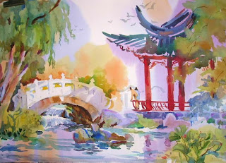
One of the more recent additions is a small Chinese garden, complete with traditional wall, water feature, and pagoda, forming an intimate outdoor room. Peace, harmony, and contemplation of nature make it a destination that both soothes and inspires.

Monet had his Giverny, Childe Hassam had Appledore Island, Sargent had the formal gardens and fountains of Italy. Somewhere near you there is probably a public garden that could provide subject matter for paintings and a refuge from the hustle and bustle of the city. Seek them out and bring your paintbrush!

Sunday, December 6, 2009

Painting In the 'Hood


Just south of the Arch and the St. Louis Riverfront is an old neighborhood called Soulard. Strolling its streets will transport you to back the 1800's. There's just something appealing about being surrounded by buildings that were around when St. Louis was the last outpost of civilization on the western frontier. Compared to the modern skyscrapers downtown, this street scene is on a human scale. Each structure has a distinct look, varying in height, size, and purpose. Many have been converted to restaurants with brick patios outback.
So after a morning of painting you can get a bite to eat in the shade of a brick and wrought iron space.
Try a street scene of a special place in your hometown.

Friday, December 4, 2009

Train Station Series


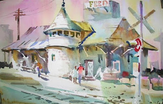
In the heart of my hometown of Kirkwood, Missouri is the historic train station. Evocative of another era, the station stands near the old city hall, and just up the street from the farmers market and the OK Hatchery. This is a landmark that just begs to be painted.

As in the painting of Jim Thorpe's train station, I took some liberties with the background. There is a feed store behind the station, but you can't see it from this viewpoint. Still I needed something in the composition to break up the space behind the station and to situate it in its surroundings.

Look around your hometown for its economic beginnings--a train station, loading docks, riverfronts, military defenses---and you're likely to find something interesting to paint.

Thursday, December 3, 2009

Painting in a Series


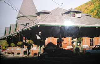
Who doesn't love an old train station? This one is located in the town of Jim Thorpe, Pennsylvania, which was originally named Mauk Chunk before the famous Olympian lent his name to the place. The architectural features of this wonderful old building made it attractive as a subject with its repeated triangular shapes. But it was the cast shadows that made it especially intriguing to me.
Cast shadows don't have to be blue. They can take on the rich tones of the local color of the object, in this case, red.
The photo you work from doesn't have to be an artistic masterpiece but only act as a reminder of the things you liked about the subject. As evidence, here is the photo of the train station I worked from. Jim Thorpe is in a very mountainous region and I wanted to indicate that, so I added mountains to both sides of the station as well as some suggestions of other building in the old town. It also keeps the perspective from leading you right out of the picture area and balances the shapes on both sides of the painting.
Remember, a photograph should not dictate the composition, the color or the content of your painting.

Wednesday, December 2, 2009

Dominance - Line


Here is a painting with a dominance of oblique lines. "Leland's Lobster Buoys" are a gradation of oblique lines that gradually approach horizontal at the top of the page.

As you have probably realized, several elements and principles are at work in a single painting. This painting also contains: 1.) diminshing repeats 2.) repetition of shape and color 3.) dominance of color. Knowledgeable painters hold several design concepts in their heads while planning and painting a picture.

Tuesday, December 1, 2009

Dominance - Line


The directions of lines in a painting can create a mood. Horizontal lines suggest rest, calm and peace. Vertical lines communicate formality and balance. Oblique lines are suggestive of movement, tension and energy.

It is desirable to establish a dominance of one line direction. Then you can use a subordinate line to provide some relief and set up a a touch of conflict.

In the painting of "Murray Hill Landing", the dominant lines are verticals. But see if if you can pick out the obliques that break up the verticality and suggest movement.

Monday, November 30, 2009

Balance


Formal balance is present when two shapes of equal size are found on both sides of the painted area. Asymetric balance is achieved when a large shape, probably in the foreground, is counter balanced by several smaller shapes on the other side of the paper or canvas. Asymetric balance is usually more desirable in landscape painting.

In "Fog at Ocean Point", the large tree on the right is balanced by the smaller trees on the left. The intervals and direction of the trees is important to clearly separate the two areas, making the balance noticeable.

When planning repeated shapes or objects, like trees, houses, groups of animals, remember to take balance into consideration for a satisfying result.

Saturday, November 28, 2009

Sign Motif


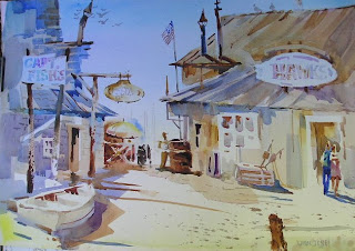
I'm sure that when some tourists travelling Hwy. 98 on their way to Apalachicola, Florida pass through the oystering community of Eastpoint, they view the hodge podge of wharves, docks and seafood warehouses as an eyesore. But the first time I saw that stretch of run down old buildings, I thought, Here is enough subject matter for a lifetime! So when Hurricane Dennis roared ashore a few years ago, I was saddened that so many places I had painted for years were gone or severely damaged. But some persevering oysterman had replaced a banner as a sign that a way of life would survive. I felt obligated to paint it.

It's not always the pretty scene that grabs your emotions.

Friday, November 27, 2009

Signs, Signs, Everywhere Signs


Where do ideas for paintings come from? I have a young friend who is in college now, but when I met him, he was four years old. For a number of summers, Chris was fascinated by the signs in Boothbay Harbor, which he carefully reproduced with crayons on drawing paper and then tacked up around his grandmother's farmhouse and barn. For the duration of his visit, every room in his grandmother's house sported signs that advertised all kinds of businesses. I would look forward to each visit to see what funny additions would appear and in what unexpected locations.

Pretty soon, I found myself seeing signs as an element not to be removed from a painting but to be included as a motif. Every once in a while I find myself returning to that subject matter, and I never fail to smile or remember the joy that Chris brought me during those summers.

Take a moment to listen to what children see or imagine as a possible inspiration for your own painting motifs.


Thursday, November 26, 2009

Happy Thanksgiving!


Happy Thanksgiving! I don't have any paintings of turkeys, so these chickens will have to do!

May your turkey be moist, your gravy have no lumps, your favorite football team be winners, and your friendships warm and comforting.

Wednesday, November 25, 2009

Alternation


Alternation is an all-over pattern that resembles a checkerboard. The lights, midtones and darks are scattered throughout the painting. This results in a very high energy painting that usually has no one focal point due to the numerous areas of contrast.

Underpainting is a key unifying factor in such an approach. With so many value changes, it is essential to find colors, textures or directional aspects to unite the space. Underpaintings provide this unity.


Tuesday, November 24, 2009

Exercise In Gradation


After yesterday's entry on gradation, I felt compelled to go to the studio. The result was "Snow Cone Stand at Fell's Point", a scene I first painted while visiting my good friend and accomplished watercolorist Lois Wolford. I assigned myself the task of using gradation of color and value to simplify every shape that was not the focal point. Look for the gradation of both color and value in the sky, the buildings and the street. The "action" in the painting is concentrated around the snow cone stand and the figures on the street. The shapes get smaller, warmer, and more textured around the stand. Gradation is the element that leads the eye to that area.
As I said before, gradation is subtle, but not monotonous. A shape that is pure in color and of one value is less interesting than one that has gradation in it.

Having a specific word or two in mind as you begin to paint makes the process of applying paint more satisfying. The results are likely to be more interesting as well.

Sunday, November 22, 2009

Gradation


Gradation is a series of gradual successive changes. In any shape you can gradually go from:
-warm to cool
-smooth to rough
-light to dark
In successive shapes, you can also go gradually from
-large to small.

The opposite of gradation is conflict. Juxtaposing a very dark and a very light or any color next to its complement will attract attention because of the extremes. Gradation deals with extremes but goes from one to the other gradually which is more subtle and less demanding.
The greatest conflicts usually occur near or at the focal point. Getting there gradually will lead the eye and provide relief from the conflict.

In "Port St. Joe Marina" for example, look at the value and temperature changes in the arches that lead to the center of the painting. Also look at the value changes in the negative shapes in the background. Most of the sudden changes or conflicts occur at or near the boat. Gradation is soothing but not monotonous, whereas conflict provides tension. You need a mix of both with one dominant.

Saturday, November 21, 2009

Plein Air Challenges and Rewards


Rain is probably the most obvious enemy to the plein air painter. But a gentle mist can add texture and prolong the dampness needed for a wet-in-wet painting.

Wind is more sneaky. The supporting board that holds the paper acts just like a sail. Many's the time I've walked away from the easel to see if the pattern is working, only to hear the easel crash from a big gust of wind.

Bugs! Once while painting with my Wednesday painting group in Boothbay, I was in a field. Several of my painter friends were at the edge of the field. Suddenly a cloud of corn ants began swirling around my head and dropping into my hair and onto the wet palette. Corn ants only live for a day, but they found me! Later my buddies said I looked like Pig Pen in the Peanuts cartoon strip, with a moving black cloud above my head.

Sun. If you paint with the sun on the paper, the paint will dry too fast and the glare will make you snow blind. Find shade or position your paper so that it will make its own shade.

Tourists can be the worst hazard, especially if you're a beginner or self conscious, or trying to concentrate at a particularly crucial stage of the painting. Little kids are the worst. Often they will point to something in the painting and then walk up and touch it. And answering the same questions from curious bystanders can be a distraction.

So with all these challenges, why paint outdoors? Because..... the sounds, the smells, the breeze, the feel of sun on your skin, the funny stories all tend to make their way into the painting. Just looking at a painting years later, I can recall all the things that happened that day. And if you get an interesting tourist and have a great conversation, you might just make a sale!

Friday, November 20, 2009

Underpainting - Creating Pathways


When I paint an underpainting, I consciously try to leave a pathway of light through the abstract shapes. Later I can decide where to leave those paths and where to cut into them with the superimposed subjects. "Wharf Life I" illustrates the progress from underpainting to finished painting. I think the pathways of light that weave through the shapes of the buildings lead the eye through the painting. This way, the shapes within the wharf are not a jumble of unrelieved rectangles.

It was also a challenge to use a different format. Sometimes an unusal size of paper forces me to rethink compositional habits.