Saturday, October 31, 2009

Halloween


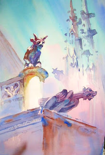
I've always loved painting sculpture, and this painting seemed perfect for Halloween.

I like the worm's eye view, too. Looking up at the gargoyles made them seem like they were going to launch themselves off the side of the building! Much more menacing.

Look for the "L", the warm color note among the cool colors, the diminishing repeats and the obliques. Happy Halloween!

Friday, October 30, 2009

Silhouetted Shapes


One of the simplest ways to describe an object is by depicting its silhouette. The advantage of this is that, if you accurately describe the outside edge of the shape, little or no details are necessary in the interior of the shape. You can recognize a dog, a boat or a vase of flowers merely by its silhouette.


"Morning at Roosting Rock" was painted very early one morning when the sun was barely up, leaving the rock and its gulls in silhouette against a blinding sea and sky.

Wednesday, October 28, 2009

The "T" in Design


One last letter to consider when designing elements in a painting. The letter "T" has a horizontal line and a vertical line. Again, where the two lines meet is a good place to put the focal point. You've seen this painting before, but probably didn't think of it as an upside down "T".

The tower of the lighthouse is obviously the vertical; the horizontals are the fence and the walkway. Where they meet, I placed the old keeper and his faithful pooch.

By the way, the only dog I seem to put in my paintings is the lab. No poodles or chihuahuas need apply!

Today I gave a one day workshop, and five wonderful ladies braved the cold, damp gray day to paint with me at Tower Grove Park. Thanks to them all! Hope you finally got some coffee!

Tuesday, October 27, 2009

The "S" in Design


The winding road subject is the best example of the "S" curve in design. But it can be applied to still lifes as well. Here, in "March of the Mushrooms" you can trace the trail of the 'shrooms and see the curve.

This painting also illustrates another landscape device---- the Diminishing Repeat, which is used to achieve perspective. Large shapes in the foreground are repeated as they recede into the background and get smaller, giving the sense of distance.

I'm basically a landscape painter, but the theories of composition apply to well designed still lifes and even portraiture paintings. Look for the "S" and the "L" in those kinds of paintings as well.

Monday, October 26, 2009

More "L" Designs


Review yesterday's entry about the "L" design device and see if you can spot it in this painting. For a more obvious "L", look again at the October 23rd posting.

Sunday, October 25, 2009

The "L" in Design


One of the best known design devices is the "L". Juxtoposing a horizontal and a vertical can direct the eye to the center of interest. In "The Rivals", the gull on the left is the vertical which keeps the eye from wandering off to the left side of the painting. The second gull is the bottom of the L and helps direct the viewer's eye to the object of their rivalry---the sea urchin. Another example of this tomorrow.

Saturday, October 24, 2009

Painting Water - Surf


Painting surf is one of the most difficult subjects I attempt. Because it's constantly moving, observation is key. One look is at the shadows in the falling wave. Another is at the breaking spume. The colors and values in the curl are worth studying. Finally watching what the surf does on its run up to the shore will help in the composition. The majority of my surf paintings end up in the trashcan, but these are a few of the more successful ones.

Friday, October 23, 2009

October 23 - Reflections


Since I spend about half my year next to salt water, I have many paintings that deal with reflections. But the same knowledge about painting them would be applied to puddles or lakes.
It is certainly worthwhile to study the edges of reflections. That is where the action of the water displays itself. Breaks in the reflection occur at the edges as do the wiggles of the ripples. The reflection should indicate the movement in the water, not a mirror image of the object. Here are two paintings where my primary interest was the reflection of the boat hulls.

Thursday, October 22, 2009

Painting Water - Ripples


Painting water is puzzling to many painters. I've often seen water that looks like it's concrete with straight hard edged stripes that are supposed to represent ripples. This is probably because photographs are being used. Water is soft and very rarely completely still. Also many times I see water scenes with ripples all the way out to the horizon. The ripples are all the same size and value. As with any perspective problem, ripples get smaller, cooler and lighter as they recede until they disappear altogether as they approach the horizon. Here's an example. (We'll talk about reflections tomorrow.)

Tuesday, October 20, 2009

Color Surrounded By Neutrals


Here's the painting that Gleason Fine Art in Boothbay Harbor chose for publicizing my show this summer in Maine. It illustrates and reinforces the same point I made in yesterday's blog: Punching up the focal point with a bit of strong color and then surrounding it with neutral hues is a way to direct the viewer's eye. In both paintings, figures are also used to enliven the same area.

I do love Maine wharf scenes!

Monday, October 19, 2009

Monday Morning Blues


My very good college friend Diane came up to St. Louis from Springfield yesterday and brought with her the painting that I had exhibited in the annual Watercolor USA show this summer. It was my first foray into the world of national competitions so I was pleased to have been recognized in that forum. The painting is titled "Dockside Blues". All the different hues of blue are complemented with the spot of orange at the center of interest. Thanks, Diane, for bringing me back the painting!

Sunday, October 18, 2009

October 18th - Using Complementary Colors


How do we make color choices when employing arbitrary color? In this painting I decided to use a split complementary color scheme. On the color wheel, yellow and orange are side by side. By using their complements ---yellow/violet, and orange/blue-- you can generate more visual energy than would occur if factual colors were depicted. Limiting the number of colors creates more harmony but the complementary hues foster tension and therefore visual entertainment. Try it!

Saturday, October 17, 2009

October 17 - Arbitrary Color


When working from photographs, a painter can become so committed to an "accurate" portrayal of the scene that the rights of the painting go right over the cliff. Painters should be more concerned with the elements and principles of design than insisting that every detail of a particular place be factually rendered. The first element that an amateur painter seems preoccupied with is color. But why not make color the subject, and not the objects in the painting? Here are some paintings in which my color choices were arbitrary and based solely on my emotional response to certain color combinations. The houses were really white, the rocky ledges, gray and the trees were a uniform green. Play with arbitrary colors and both you and the viewer might get more excited about the scene.


Thursday, October 15, 2009

Thursday October 15


Going back to a previous subject has both advantages and disadvantages. I chose to paint a subject I did early this week in order to find ways to make it more interesting. In the first version, there seemed to be no relief in the rectangle of the larger building, nor in the foreground. By adding a net with its resultant cast shadows, and the boat in the foreground, the shapes changed and created more interest. I also raised the height of the buildings to eliminate some of the negative space, making it a more interesting space as well.


The disadvantage of re-painting a subject is that it might become a boring enterprise. So specific goals---changing shapes, colors, textures----must be in your mind before you begin. Here are both paintings. You decide!

Monday, October 12, 2009

Monday, October 12th


Starting back slowly after the long trip. Today I decided to use the Velasquez palette: yellow ochre, burt sienna, and dark blue/black. I combined two photos I took in the Catskills, and created this composition. Not totally pleased, so I may try it again tomorrow. Check in then.

Friday, October 9, 2009

Friday October 9, 2009


I've been unpacking since I got home Monday afternoon, so painting has been on hold. But this morning, it's back to the easel. Meanwhile, I thought I'd share another painting from this summer. My goal over the past few months has been to explore color and movement, and I think "Happy Flags" achieves both. The subject is the scene at Brown's Wharf in Boothbay Harbor, Maine with all its banners and nautical flags.