Monday, November 30, 2009

Balance


Formal balance is present when two shapes of equal size are found on both sides of the painted area. Asymetric balance is achieved when a large shape, probably in the foreground, is counter balanced by several smaller shapes on the other side of the paper or canvas. Asymetric balance is usually more desirable in landscape painting.

In "Fog at Ocean Point", the large tree on the right is balanced by the smaller trees on the left. The intervals and direction of the trees is important to clearly separate the two areas, making the balance noticeable.

When planning repeated shapes or objects, like trees, houses, groups of animals, remember to take balance into consideration for a satisfying result.

Saturday, November 28, 2009

Sign Motif


I'm sure that when some tourists travelling Hwy. 98 on their way to Apalachicola, Florida pass through the oystering community of Eastpoint, they view the hodge podge of wharves, docks and seafood warehouses as an eyesore. But the first time I saw that stretch of run down old buildings, I thought, Here is enough subject matter for a lifetime! So when Hurricane Dennis roared ashore a few years ago, I was saddened that so many places I had painted for years were gone or severely damaged. But some persevering oysterman had replaced a banner as a sign that a way of life would survive. I felt obligated to paint it.

It's not always the pretty scene that grabs your emotions.

Friday, November 27, 2009

Signs, Signs, Everywhere Signs


Where do ideas for paintings come from? I have a young friend who is in college now, but when I met him, he was four years old. For a number of summers, Chris was fascinated by the signs in Boothbay Harbor, which he carefully reproduced with crayons on drawing paper and then tacked up around his grandmother's farmhouse and barn. For the duration of his visit, every room in his grandmother's house sported signs that advertised all kinds of businesses. I would look forward to each visit to see what funny additions would appear and in what unexpected locations.

Pretty soon, I found myself seeing signs as an element not to be removed from a painting but to be included as a motif. Every once in a while I find myself returning to that subject matter, and I never fail to smile or remember the joy that Chris brought me during those summers.

Take a moment to listen to what children see or imagine as a possible inspiration for your own painting motifs.


Thursday, November 26, 2009

Happy Thanksgiving!


Happy Thanksgiving! I don't have any paintings of turkeys, so these chickens will have to do!

May your turkey be moist, your gravy have no lumps, your favorite football team be winners, and your friendships warm and comforting.

Wednesday, November 25, 2009

Alternation


Alternation is an all-over pattern that resembles a checkerboard. The lights, midtones and darks are scattered throughout the painting. This results in a very high energy painting that usually has no one focal point due to the numerous areas of contrast.

Underpainting is a key unifying factor in such an approach. With so many value changes, it is essential to find colors, textures or directional aspects to unite the space. Underpaintings provide this unity.


Tuesday, November 24, 2009

Exercise In Gradation


After yesterday's entry on gradation, I felt compelled to go to the studio. The result was "Snow Cone Stand at Fell's Point", a scene I first painted while visiting my good friend and accomplished watercolorist Lois Wolford. I assigned myself the task of using gradation of color and value to simplify every shape that was not the focal point. Look for the gradation of both color and value in the sky, the buildings and the street. The "action" in the painting is concentrated around the snow cone stand and the figures on the street. The shapes get smaller, warmer, and more textured around the stand. Gradation is the element that leads the eye to that area.
As I said before, gradation is subtle, but not monotonous. A shape that is pure in color and of one value is less interesting than one that has gradation in it.

Having a specific word or two in mind as you begin to paint makes the process of applying paint more satisfying. The results are likely to be more interesting as well.

Sunday, November 22, 2009

Gradation


Gradation is a series of gradual successive changes. In any shape you can gradually go from:
-warm to cool
-smooth to rough
-light to dark
In successive shapes, you can also go gradually from
-large to small.

The opposite of gradation is conflict. Juxtaposing a very dark and a very light or any color next to its complement will attract attention because of the extremes. Gradation deals with extremes but goes from one to the other gradually which is more subtle and less demanding.
The greatest conflicts usually occur near or at the focal point. Getting there gradually will lead the eye and provide relief from the conflict.

In "Port St. Joe Marina" for example, look at the value and temperature changes in the arches that lead to the center of the painting. Also look at the value changes in the negative shapes in the background. Most of the sudden changes or conflicts occur at or near the boat. Gradation is soothing but not monotonous, whereas conflict provides tension. You need a mix of both with one dominant.

Saturday, November 21, 2009

Plein Air Challenges and Rewards


Rain is probably the most obvious enemy to the plein air painter. But a gentle mist can add texture and prolong the dampness needed for a wet-in-wet painting.

Wind is more sneaky. The supporting board that holds the paper acts just like a sail. Many's the time I've walked away from the easel to see if the pattern is working, only to hear the easel crash from a big gust of wind.

Bugs! Once while painting with my Wednesday painting group in Boothbay, I was in a field. Several of my painter friends were at the edge of the field. Suddenly a cloud of corn ants began swirling around my head and dropping into my hair and onto the wet palette. Corn ants only live for a day, but they found me! Later my buddies said I looked like Pig Pen in the Peanuts cartoon strip, with a moving black cloud above my head.

Sun. If you paint with the sun on the paper, the paint will dry too fast and the glare will make you snow blind. Find shade or position your paper so that it will make its own shade.

Tourists can be the worst hazard, especially if you're a beginner or self conscious, or trying to concentrate at a particularly crucial stage of the painting. Little kids are the worst. Often they will point to something in the painting and then walk up and touch it. And answering the same questions from curious bystanders can be a distraction.

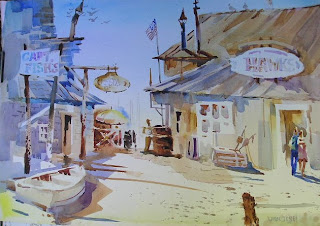
So with all these challenges, why paint outdoors? Because..... the sounds, the smells, the breeze, the feel of sun on your skin, the funny stories all tend to make their way into the painting. Just looking at a painting years later, I can recall all the things that happened that day. And if you get an interesting tourist and have a great conversation, you might just make a sale!

Friday, November 20, 2009

Underpainting - Creating Pathways


When I paint an underpainting, I consciously try to leave a pathway of light through the abstract shapes. Later I can decide where to leave those paths and where to cut into them with the superimposed subjects. "Wharf Life I" illustrates the progress from underpainting to finished painting. I think the pathways of light that weave through the shapes of the buildings lead the eye through the painting. This way, the shapes within the wharf are not a jumble of unrelieved rectangles.

It was also a challenge to use a different format. Sometimes an unusal size of paper forces me to rethink compositional habits.

Wednesday, November 18, 2009

Underpainting


Yesterday some of Carol Carter's students asked me about underpainting. Oil painters are accustomed to using the technique, for instance with a flat field of red. Watercolorists also use underpainting, which can be soft edged, wet-into-wet, or sharp edged shapes that form an abstract pattern. After the underpainting dries, the subject matter is super-imposed on the abstract pattern. Both the colors and the pattern influence the second layer, providing unity and harmony.
Notice also the curvilinears in the underpainting and the repeated circles in the subject. And as mentioned in yesterday's blog, watch for the softened edges near the edges of the paper.
Perhaps these photos will help to demonstrate the process.
"I Love a Parade" is the second in a series of 4th of July subjects.

Tuesday, November 17, 2009

Edge Control


This painting of Pemaquid Lighthouse in Maine is about the lighthouse and the keeper's house, not about the fence surrounding the buildings. Nothing was to be gained by painting each piece of the picket fence which would draw attention where I didn't want it to be. By losing the edges and only suggesting the fence, your eye stays out where I want it to be...on the lighthouse.

Today I will be a guest speaker at Carol Carter's watercolor class at Maryville College. A little biography, a little technique and a little travelogue. I'm really looking forward to it!

Monday, November 16, 2009

Edge Variety


One of the distinguishing marks of experienced painters is the quality of edges in their paintings. Hard edges abound in the works of fledgling artists. Knowing where to lose an edge is the hallmark of an advanced painter.

If you remember that the areas of most contrast attract the most attention, you'll begin to center those contrasts around the focal point. The greatest contrast in values, colors and edges will attract the eye. Using hard edges at the center of interest and softer edges at the periphery will help the viewer locate the subject that is of most interest to the artist.

This painting of "The Carthage Deli" is one of the few interiors I've done. It's good to reach beyond one's comfort zone. Notice the hard edges around the figures and some of the memorabilia, and contrast those with the softer edges at the peripheries. The old gas pump, for example, acts as a frame, but it's not the center of interest, so I softened most of its edge.
So tread softly!

Saturday, November 14, 2009

Working in a Series


One more painting in the ongoing series of masts and rigging against the sky. This one was done from the Topside Inn at the top of McKown Hill in Boothbay Harbor, Maine. The Friendship of Salem was up on the ways at Sample's Shipyard being overhauled, and it was the perfect foil for looking out at the whole bay beyond.
When I get the itch to paint, and a new subject is not readily apparent, I have several themes that I can return to until a new subject presents itself. A wonderful bi-product of working in a series is that you begin to look and see more intensely at things that others may overlook. After all, painting is a special way of seeing.

Friday, November 13, 2009

Demo


For better or worse, here's how the demo turned out last night. I think I'll try this again sometime. Thanks to the members of Art World!

Thursday, November 12, 2009

Following My Own Advice


A few days ago, I suggested that you go with your first impression in order to keep your enthusiasm fresh and charged. Now I'm faced with that choice.
Tonight I've been asked to give a demo at a local art group, so the last two days I've been considering various subjects and design approaches. I should probably play it conservatively and paint something I've done before, or a subject that I think the members of the art club would deem appropriate.
But I keep coming back to a subject I saw this past weekend on my trip to Carthage, Missouri. It's a funky little house, tall and Victorian. I tried some other sketches, but I kept thinking about that whimsical structure. So I've done the value sketch, and I'm going for it! Here it is, hillbilly, chickens,outhouse, laundry on the line and all.
If the painting turns out, I'll post it tomorrow. If it doesn't, they may just never invite me back. But I want to paint this! As I've said, Take a chance!

Wednesday, November 11, 2009

Painting in a Series


Yesterday I wrote about painting the shrimp boats in Apalachicola. The lacy rigging against the sky has a quality that appeals to me. Once you find a subject that intrigues you, it may be worth a second, third, and fourth look. Not only will it teach you how to approach painting the subject with more confidence, you will learn information about that subject. Inevitably, a shrimp boat captain will come over for a look, and I can ask him questions about how the boat operates, contact that an ordinary tourist may not get to experience.
Lots of people ask me how I get the rigging lines so straight. They assume I've used a ruler
The secret is in the speed of the stroke. The slower the stroke, the more hesitation is likely to show up. The nervousness will result in wavy lines. So being familiar with a subject because you're working in a series will let you just "hit" that line. So don't just paint a subject once!

Tuesday, November 10, 2009

Eliminating Details


When you come across a scene that you think might make a good painting, it's a good idea to tell yourself what element attracted your eye in the first place. That way you can figure out how to emphasize it. The thing that I most liked about this view of shrimp boats tied up to a dilapidated dock was the lacy quality of the hauling gear against the sky. A good solid indication of the boat was enough to support the "star" of the painting which is the lace of beams, ropes, wires and gears. That texture is what caught my eye right away.
To keep the viewer from drifting to the foreground and all the details at the bottom of the painting, I elminated the "trash" by the shore so I could portray the water and reflections very simply. Eliminating unnecessary and distracting details helps the viewer focus on the details you want them to look at. Including texture in the foreground, middle ground and background will only confuse the viewer. Be selective!

Sunday, November 8, 2009

A Painting Holiday


Two days ago, having heard that the forecast was for 70 degrees the entire weekend, I decided to hop in the car for a little drive. I ended up in Carthage, Missouri which is listed in my favorite guidebook America's Most Charming Towns and Villages. After a look around yesterday, I decided that I would paint today at a town of old buildings that has been assembled over the years by a man named Lowell Davis, a painter, sculptor and author, not to mention great conversationalist.


Today I went back to Red Oak II, and this time was greeted by Lowell himself who came out to watch me paint. I also got a tour of his house which he termed "Asian Log Cabin." It was filled with paintings, sculptures, and Chinese urns. I especially enjoyed his studio which he called his pennance space. One day in his old studio in a separate building, he had what he called a "bad hair day", and the whole place went up in flames. A lifetime of paintings and drawings. It was a painting holocaust.
But the work he had salvaged was glorious. He's a very good painter.
A great adventure of a day.
Here's Lowell and the painting I did of the town's Marshall's office.


Friday, November 6, 2009

Go With First Impressions


When arriving at a plein air site, whether or not you've been there before, try not to bring any pre-conceptions with you. For example, if you go to a familiar location and have always painted the same subject, but this time something else catches your eye, maybe that should be a clue to what your enthusiasm is for that day. Once I went to the Cozy Harbor Yacht Club with the intention of painting the youngsters who were out for their sailing lessons. The kids had parked their bicycles in back of the building. I kept trying to convince myself to paint the small sailboats, but the bikes kept calling me. Then I decided the bikes were too hard. But finally I gave in and painted the bikes using a diminishing repeat that carefully described the couple of bikes in front, and used diminishing repeats to suggest the rest of the bikes. Way out in the distance past the building and the bikes, I placed a couple of small sailboats. I still titled it "The Sailing Lesson". It sold the day after I put it in the gallery.
This painting was at Liberty Farm in Boothbay, Maine. My Wednesday Plein Air group friends were all painting the wonderful old barn and farmhouse. But for me the day was about all the chickens that were underfoot, scratching and clucking. And when I spotted the woodpile, I knew that I had to paint them near it.
Go with your first impression! You'll probably bring more conviction and excitement to the subject.

Wednesday, November 4, 2009

Using Your Sketchbook


Sketching is a pleasure all its own, but as an aid to planning values in a painting, it can be invaluable. Before you attempt painting on that expensive piece of paper, it is worth a few minutes to map out the placement of your darks, lights and midtones. In "Bayou Boatyard", the whites were particularly important in establishing a pathway through the painting. Then surrounding them with darks further highlighted the white shapes. With pre-planning, the lively washes are easier to execute. Grab your sketchbook and get going!

Monday, November 2, 2009

Portraits


Even though my preference is for landscape painting, I have occasionally dabbled in still life and portraiture. The skills needed for a good painting are applicable to these two subjects. It is really just a matter of good drawing skills.
Most portraits are done in oil or pastel because of their plastic natures. Very few watercolor painters feel confident enough to attempt a portrait, which demands more exactness in the matter of getting a likeness. Furthermore, the nature of watercolor lends itself to a looser, more spontaneous kind of brushwork.
When painting a portrait, I usually begin, not with an outline of the head, but with the dominant eye. Then I measure the distance to the nose or the eyebrow. Then from the nose to the mouth, etc.
In my profile, I mentioned that I used to teach high school literature. Ernest Hemingway is one of my favorite novelists. Every year when I began the unit on a Hemingway novel, I would bring in this portrait of "Papa". I also painted characters or scenes from the novels: bullfighting in Spain, trout fishing along the Irati River, or the young soldiers in several of his novels.
In this way I could combine my two great loves: painting and reading.

Sunday, November 1, 2009

Bird's Eye View


Yesterday I referred to the "Worm's Eye View" -- looking up at the subject. In "Pogie Boat", the point of view is above the subject, a "Bird's Eye View".

All sorts of considerations make this painting one of my favorites. First, it is one of the few vertical paintings I've done. Also the oblique lines and shapes help create movement. The orange color note on the fisherman's slicker draws the eye. The snapshot quality of the scene, with the second fisherman cut off to keep your focus on the other figure, is reminiscent of some of Edgar Degas' racetrack paintings. I also like the suggestion of all those pogies lying in the bottom of the boat which had to be simplified into one more or less white shape.

And finally, it is a reminder of all those times when I've seen fisherman unloading their catch in Maine. They work hard for their money. Pogies are an extremely foul smelling fish, which is why they are such an attractive bait to catch those bottom feeding lobsters. Looking down a bait barrel full of pogies in the pre-dawn gloom on a rough sea is not my idea of a romantic occupation. As a lover of lobster, I'd like to say thank you to the men and women who cope with those kinds of conditions so I can enjoy a nice meal!