Wednesday, December 30, 2009

The One That Got Away


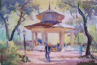
When I was nearly finished painting the bandstand at the seaside park in Apalachicola today, a young college couple stopped by on their bikes to admire the painting--Chase and Shelby. Chase proudly but quietly told the story of how on Christmas Day he left a note for Shelby to go to the new fountain in Water Street Park at 1:00. When Shelby arrived, she found another note instructing her to go to another location where a third note awaited her. On to another location until finally she arrived at the bandstand.

The note there was accompanied by a blindfold and directed her to "Put on the blindfold to cover your eyes, and you will get a big surprise." Chase came up behind her, and told her to turn around and take off the blindfold. There was Chase, on one knee with a modest engagement ring for Shelby which she then showed me, beaming shyly.

We chatted a while, and they admired the painting several times. Then they pedalled off down the boardwalk to the Gulf. By the time they returned, I had made up my mind. I wanted to get them started on their art collection. I had only one request: that they frame it nicely. I suggested that someone could frame it for them as a wedding gift.

Call me sentimental, but they were such a sweet couple that I couldn't help myself. So good luck, Chase and Shelby (and yes, she got her name because her mom is a big fan of "Steel Magnolias."), and to all young lovers everywhere!


Monday, December 28, 2009

The Problem Is....
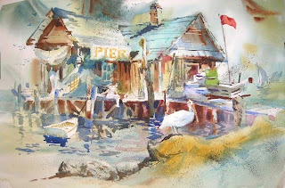


For the past several years, my goal has been to create paintings with a feeling of movement and energy. The problem to be solved is to infuse a static image with the illusion of movement, not an easy task.
I have gradually come to several conclusions:
1. Include many shapes of varying sizes.
2. Use oblique lines.
3. Vary hard and soft edges.
4. Interrupt lines.
5. Overlap shapes.
6. Invent textures.
7. Spice it up with figures (or animals) in motion.

This kind of painting is much harder than merely depicting a scene accurately, and I fail more often than I succeed. So why try it? "A man's reach should exceed his grasp, or what's a heaven for?"


Saturday, December 26, 2009

Value Patterns
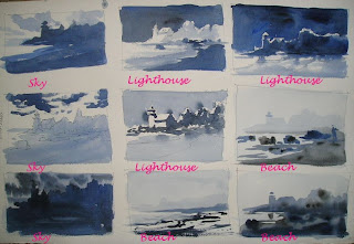

While I'm waiting for the temps to warm up here in Apalachicola, here's a little lesson I learned from Skip Lawrence's book. It's a variation on Ed Whitney's value patterns. Using the three values, Skip says, play 2 Against 1.

For example, a light and dark shape in the sky with a midtone in the middle and foreground will draw attention to the sky.

To highlight the middle ground, use a light and mid tone there with darks in the sky and foreground.

To emphasize the foreground beach, use two values there. The illustrations of Hendrick's Head Lighthouse are mine.

Thursday, December 24, 2009

Merry Christmas!


Greetings! Some of you are closer to this scene than I am! Have some eggnog, light the Yule Log, and enjoy your friends and family. Merry Christmas!

Wednesday, December 23, 2009

Change is Good
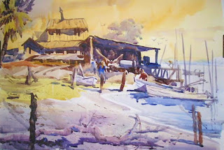

Here I am in Apalachicola, Florida. Actually I'm in Eastpoint, four miles across the bay from Apalach. Eastpoint is an oystering community with wharves, docks, wholesale seafood stores, and oyster and shrimp boats. There's just something about working docks that have always fascinated me.

In this painting, I gave myself two assignments: Choose a color other than blue for the sky, and maximize the value contrasts near the focal point. I could actually see all sorts of things under the roof, but chose to simplify the shadow area into one shape. Then I concentrated on making the shape interesting at the edges. Rectangles are dreadfully boring shapes, so look for ways to pop out an edge or cut into it. And don't forget the obliques!


Monday, December 21, 2009

To Market, To Market


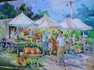
I'm on the road to Apalachicola, Florida, so I will resume commentary very shortly. Meanwhile, here is the last painting I did this summer of the Farmers Market in Boothbay, Maine. Happy Holidays, everyone!

Saturday, December 19, 2009

Working the Wheel
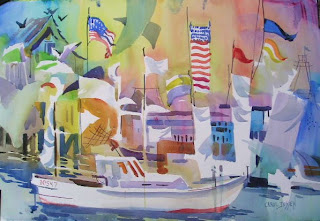

Here's another painting in which I used the technique I described yesterday. I think you can see the gradation of color in the background that gradually goes around the color wheel.

I'm getting ready to hit the road for my annual painting trip to Florida. My sympathies to all who are dealing with the massive snowstorm on the eastern seaboard. It will be nice to be out of the path of snow and ice for a while!

Friday, December 18, 2009

'Round the Wheel


Once in while, when I'm thinking about backgrounds, I take a clue from the color wheel. I'll start in one corner with a cool red (alizarin crimson), then go around the color wheel: warm red to orange to yellow to yellow green to green to blue green to blue. Gradation of color.

When imposing colors for the subject I try to think of the complementary color in the second glaze. The result is a kind of rainbow effect of bright, cheery colors.

In this painting of the Farmers Market in Boothbay, I've shown the first wash and the final painting so you can see the process.


Again, thinking of design primciples like gradation rather than just subject matter will give some zip to your painting.

Monday, December 14, 2009

Market Series
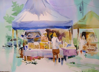

Thursdays are set aside for the Farmers' Market on the common in Boothbay, Maine. Friends Judi Wagner and Tony van Hasselt and I can often be found there painting the vendors and their wares. One of my favorite stops is "The Mushroom Man's Stand". I love cooking with mushrooms!
Does your town have a farmers' market? It's great for watching people, and the colors are vivid. And the produce and flowers are fun to bring home to make a different kind of art!


Saturday, December 12, 2009

Say It With Darks
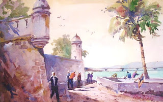

Once in a while I can still have trouble with the colors in a painting. It could be indecisiveness and thus, overmixing or overglazing. In this demo I did yesterday, I reminded my student that, even if the colors get muddied, you can still rescue a painting with the values. Often I will just remind myself that by going darker, the contrast in values can reestablish the feeling of light.

Someone once said, "If you walked into any art classroom, a valid criticism would be, 'More darks.'" Use darks to say light.


Thursday, December 10, 2009

Silhouette - Jackson Square
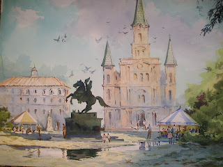

One last "St. Louis" subject. This is Jackson Square in New Orleans. Behind the statue of Jackson is the St. Louis Cathedral.

Once more, a silhouette saved the day. Overlapping creates a feeling of distance, and the silhouette was the easiest way to make the overlap. It simplifies the statue, and the strong value contrast draws the eye to the hero of the Battle of New Orleans.

Repeats of triangular shapes, puddle reflections, and balance---I've spoken of these before.

Much in this scene is invented for the purpose of composition and design elements. Take liberties if need be. People will still recognize the place.

Wednesday, December 9, 2009

Silhouette - St. Louis


While I'm on the subject of St. Louis, I thought I'd include this painting of the great man himself, the namesake of our fair city, that I did as a demo for one of my workshops. The statue is located in front of the St. Louis Art Museum in Forest Park.
The subject was silhouettes and negative spaces. My students were apprehensive about drawing the statue, so I pointed out that if they drew the negative spaces between the legs of the horse rather than thinking "legs" that the drawing would be easier. Then they could relate those lines to others. They surprised themselves with the accuracy of their efforts.

Not my finest composition, but another illustration of how the painter can say things simply with a silhouette.

Tuesday, December 8, 2009

Putting It Together
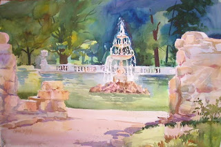


John Singer Sargent's paintings of fountains in Italy first inspired me to seek out fountains as subject matter. This one can be found in Tower Grove Park in South St. Louis, an old Victorian Park conceived by Henry Shaw. The faux ruins are salvage from a hotel that burned in the 1800's.
The ruins serve as a frame of the fountain. Many design elements I've talked about before are present in this painting.
Balance -- Look at the tree trunks in the background and the size of the ruins on both sides of the paper.

Line --- The calm, soothing, formal horizontals and verticals, balanced by the oblique lines in the foreground that subtly point to the fountain.

Edge control -- The soft edges within the ruins. Stones are only suggested, and then only some of them.

Contrast -- The darkest darks and lightest lights form around the focal point: the fountain.

Painting is a juggling act. Keeping all the design principles and elements in the air at once is no simple task, but in no other way will a well structured painting result. The key, as always, is in the planning. Value sketches and preliminary drawings make the painting act smoother and more predictable while also allowing for some impromptu changes. Plan like a turtle; paint like a hare.


Monday, December 7, 2009

Hometown Series-Gardens
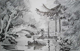


St. Louis has many identities: Gateway to the West, southern town, midwestern city, river town, home to Cardinal nation. Many immigrants have called St. Louis home: , Germans, Irish and French settlers, and the Italians who settled on "The Hill".
The amalgam of cultures is also reflected in the various garden styles at Shaw's Garden in the Tower Grove section of St. Louis. The Japanese Garden enjoys status as one of the finest in the country. There is also a fine English Woodland Garden. Very formal layouts are reminiscent of French gardens.
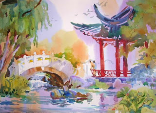
One of the more recent additions is a small Chinese garden, complete with traditional wall, water feature, and pagoda, forming an intimate outdoor room. Peace, harmony, and contemplation of nature make it a destination that both soothes and inspires.

Monet had his Giverny, Childe Hassam had Appledore Island, Sargent had the formal gardens and fountains of Italy. Somewhere near you there is probably a public garden that could provide subject matter for paintings and a refuge from the hustle and bustle of the city. Seek them out and bring your paintbrush!

Sunday, December 6, 2009

Painting In the 'Hood
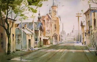


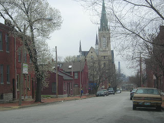
Just south of the Arch and the St. Louis Riverfront is an old neighborhood called Soulard. Strolling its streets will transport you to back the 1800's. There's just something appealing about being surrounded by buildings that were around when St. Louis was the last outpost of civilization on the western frontier. Compared to the modern skyscrapers downtown, this street scene is on a human scale. Each structure has a distinct look, varying in height, size, and purpose. Many have been converted to restaurants with brick patios outback.
So after a morning of painting you can get a bite to eat in the shade of a brick and wrought iron space.
Try a street scene of a special place in your hometown.

Friday, December 4, 2009

Train Station Series
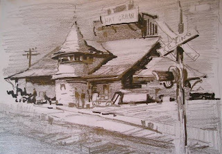


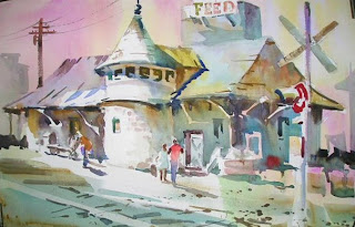
In the heart of my hometown of Kirkwood, Missouri is the historic train station. Evocative of another era, the station stands near the old city hall, and just up the street from the farmers market and the OK Hatchery. This is a landmark that just begs to be painted.

As in the painting of Jim Thorpe's train station, I took some liberties with the background. There is a feed store behind the station, but you can't see it from this viewpoint. Still I needed something in the composition to break up the space behind the station and to situate it in its surroundings.

Look around your hometown for its economic beginnings--a train station, loading docks, riverfronts, military defenses---and you're likely to find something interesting to paint.

Thursday, December 3, 2009

Painting in a Series
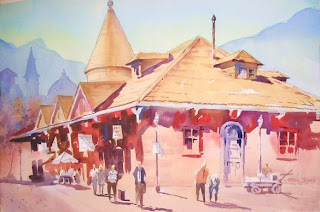


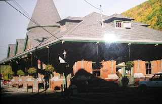
Who doesn't love an old train station? This one is located in the town of Jim Thorpe, Pennsylvania, which was originally named Mauk Chunk before the famous Olympian lent his name to the place. The architectural features of this wonderful old building made it attractive as a subject with its repeated triangular shapes. But it was the cast shadows that made it especially intriguing to me.
Cast shadows don't have to be blue. They can take on the rich tones of the local color of the object, in this case, red.
The photo you work from doesn't have to be an artistic masterpiece but only act as a reminder of the things you liked about the subject. As evidence, here is the photo of the train station I worked from. Jim Thorpe is in a very mountainous region and I wanted to indicate that, so I added mountains to both sides of the station as well as some suggestions of other building in the old town. It also keeps the perspective from leading you right out of the picture area and balances the shapes on both sides of the painting.
Remember, a photograph should not dictate the composition, the color or the content of your painting.

Wednesday, December 2, 2009

Dominance - Line
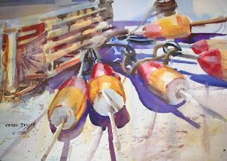

Here is a painting with a dominance of oblique lines. "Leland's Lobster Buoys" are a gradation of oblique lines that gradually approach horizontal at the top of the page.

As you have probably realized, several elements and principles are at work in a single painting. This painting also contains: 1.) diminshing repeats 2.) repetition of shape and color 3.) dominance of color. Knowledgeable painters hold several design concepts in their heads while planning and painting a picture.

Tuesday, December 1, 2009

Dominance - Line
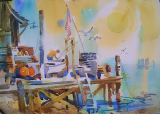

The directions of lines in a painting can create a mood. Horizontal lines suggest rest, calm and peace. Vertical lines communicate formality and balance. Oblique lines are suggestive of movement, tension and energy.

It is desirable to establish a dominance of one line direction. Then you can use a subordinate line to provide some relief and set up a a touch of conflict.

In the painting of "Murray Hill Landing", the dominant lines are verticals. But see if if you can pick out the obliques that break up the verticality and suggest movement.