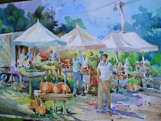

Once in while, when I'm thinking about backgrounds, I take a clue from the color wheel. I'll start in one corner with a cool red (alizarin crimson), then go around the color wheel: warm red to orange to yellow to yellow green to green to blue green to blue. Gradation of color.
When imposing colors for the subject I try to think of the complementary color in the second glaze. The result is a kind of rainbow effect of bright, cheery colors.
In this painting of the Farmers Market in Boothbay, I've shown the first wash and the final painting so you can see the process.
Again, thinking of design primciples like gradation rather than just subject matter will give some zip to your painting.


No comments:
Post a Comment