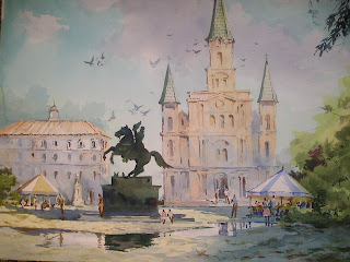
One last "St. Louis" subject. This is Jackson Square in New Orleans. Behind the statue of Jackson is the St. Louis Cathedral.
Once more, a silhouette saved the day. Overlapping creates a feeling of distance, and the silhouette was the easiest way to make the overlap. It simplifies the statue, and the strong value contrast draws the eye to the hero of the Battle of New Orleans.
Repeats of triangular shapes, puddle reflections, and balance---I've spoken of these before.
Much in this scene is invented for the purpose of composition and design elements. Take liberties if need be. People will still recognize the place.


No comments:
Post a Comment