Sunday, January 31, 2010

From Sketch to Painting


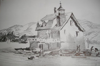
Keeping a sketchbook handy is a habit that can aid the painting process. It's the place where I work out many of the kinks before I get my brushes out. Sketching is like brainstorming. Values, placement, size, lighting, and elimination of unnecessary elements are worked out ahead of time.


A sketch is not a drawing. Drawing strives for accuracy of line and many times details that don't necessarily involve compositional considerations. A sketch is looser and freer than a drawing and is not concerned with being a finished work of art. It is a plan of action.


Here is the sketch and the resulting painting of the lighthouse in Rockland, Maine.


Thursday, January 28, 2010

Painting Through


I love to paint the shrimp boats over at Scipio Creek where the fleet is harbored. The booms, wires, gears and nets that form a lacy pattern against the lighter background attracts my eye every time. Today I painted the building which houses the estuary research facility.
When painting the sky, paint through any areas that will eventually be darker. (The exception is if that midtone is going to be warmer and you don't want it influenced by the cool sky tones.)


When painting a midtone shape, be aware of subtle color changes and creating an interesting shape. Paint through all the areas that will eventually be darker. For instance, the building was once all one value. When it was dry, I came back in with the darker shadows. These darks must be bold enough so you don't have to go back over them again. Paint through all the rigging that will eventually be even darker. Find the major struts and bars that do the hauling, and you can then be a little more flexible and inventive with the rest of the lines and wires. Then load the brush with lots of paint and little water to make the darkest lines in the composition.


Paint through areas that will eventually be darker. Don't stop at the line where a darker shape will be or you'll get a halo effect that will look unnatural. Knowing ahead of time where your lights, midtones and darks will be will allows you to paint through those areas that will later be darks.

Wednesday, January 27, 2010

Apalachicola


I've been in Apalachicola for over four weeks but it's been so windy, cold, rainy and foggy, that not many paintings have gotten done. Yesterday I tried to paint in a fierce wind, and the easel kept threatening to blow over so I spent more time grabbing for it than I did painting!


But today was sunny and nearly windless. I decided to try a street scene so you could see one of the main corners in the historic little town. The building in the distance is an old armory. I simplified its shape to a silhouette, and then overlapped it with the darker shapes of the foreground buildings. Figures help make it look like it's not a ghost town.


See shapes before you see details within the shape. Keep any details in the distance to a minimum. The viewer, who is not standing in front of the scene, will not miss them.

Monday, January 25, 2010

Re-Interpreting an Old Subject


Here's one last painting in the Wharf Life Series. This time the focus shifts to the area under the pier. I even invented a floating dock that wasn't there. Again strong color plays an important role and there is an overall checkerboard pattern. I'm also including the first painting in the series to show the evolution in style.

Saturday, January 23, 2010

Re-Interpreting an Old Subject


First of all, let me say I apologize for not posting for a while. I haven't gotten a signal here at the lodge for a few days. I hope the problem is solved.


Here's another version of the same subject I spoke of last time. This time it is color rather than overlapping that was my focus. Painting a gray building is a challenge that can sometimes be overcome by splashing on the color. In this version I let the oil tank's color define it as a focal point.


Imaginary color is a device that lends needed interest and drama to an otherwise low key subject.

Thursday, January 21, 2010

Overlapping Shapes


For the next few posts, I would like to show you how you can re-interpret an old subject. One of my favorite painting spots is on the eastside of Boothbay Harbor. I like the subject--an old cluttered wharf--and there's plenty of parking on the cement dock where I set up my easel. Plus, this is a spot that very few tourists find, thus allowing me uninterrupted painting.


The buildings on most docks are a rather boring shape---a rectangle. One way to tackle this problem is by using overlapping objects to break into the static shape (the oil tank). Another is by connecting the shape to other objects (the crates, figure and barrels).


A circle is also a boring shape, so I found a way to interrupt the the end of the oil tank shape with an overlap.


To avoid a straight line where the pilings meet the water, I added a rowboat and some reflections, and angled the foreground.


Overlaps provide depth, but they can also break into a shape with little or no interest.

Monday, January 18, 2010

The Frame


Yesterday I spoke of placing an object in the foreground to frame a subject. Sometimes though, the frame becomes the subect.


In this painting of The Trees of Ocean Point, the lighthouse in the background is almost incidental, more of a balancing element than a focal point. The real subject is the twisted tree trunk with its shadows and foliage.


Yesterday's frame existed on only one side of the composition. In this painting the frame is on three sides of the painting. The second tree group is an eye-stopper to keep the viewer from wandering off the paper.


Also, examine the major trunk to see the multiple colors and gradations that give it more interest than painting a solid brown or gray trunk.

Sunday, January 17, 2010

Framing


No, I'm not talking about putting a mat and frame on your watercolor. A very old compositional technique is to place an object in the foreground to look past or around at the focal point. The foreground object acts as a frame around the primary subject.

This scene is right outside my window here in Eastpoint looking down the Apalachicola River Basin. The palm tree in the foreground serves to frame the dock. Right now those palm fronds are blowing in the stiff breeze coming off the estuary.

In photography and painting, peeking around the corner helps to give a context for the subject as well as keeping the eye in the picture area.

Thursday, January 14, 2010

The Not-So-Pretty Subject


Who knows why some artists are attracted to one subject more than another. Some paint wildlife exclusively while others paint mountain scenes. Some are interested in the human figure, while others are compelled to paint flowers. This painting causes me to wonder why I am so drawn to old, weathered, dilapidated waterfronts.


Maybe it's the work being done there. Or maybe it's the feeling of down to earth history. It could be the textures, the rough way of making a living. But the pull is strong.


In this painting of Water Street along the working waterfront in Apalachicola, the subject matter demanded lots of textures and an absence of strong colors. I used just a spot of rusty color to break up the grays and blacks of the warehouses. Study the underpainting by looking at the ladder and you'll see that I started with burnt sienna and faded to blue/gray. Then I painted the negative space to pop out the ladder.


The design is basically an upside down T. Lots of obliques give the feeling of some movement in a very static scene. Despite its deserted look, I wanted the painting to suggest that there is still life going on here.


Tuesday, January 12, 2010

Many Happy Returns


This is one of my favorite painting locations in Boothbay Harbor, Maine. You never know what kind of vessel will be tied up to this dock, waiting to get up on the ways for repairs at Sample's Shipyard.

Returning to a favorite location can be a way to get through a painter's block. I love to paint boats, and I feel comfortable painting them. One of the best ways I've found to get back in the groove and keep your hand hot is to paint something you are totally familiar with, something you've been successful at painting before. It can also be a choice when trying to break through to something new. Familiarity can provide comfort, but it can also produce boredom, causing experimentation.

So whether you're trying to feel comfortable or to experiment with something new, try an old location and let the juices flow!

Monday, January 11, 2010

Vignettes


Okay....I'll admit it. I have a bias against flower "portraits". I guess I've just seen too many iris paintings in local art shows. However, here is a painting I did one morning out at Ocean Point of some Rugosa roses (beach roses) and their fruit, the rose hips.

The format is a vignette, which is a shape in the picture field that touches three edges of the paper at different intervals, leaving the rest of the painting as the white of the paper. It requires making the shape interesting so that the negative space will also be interesting.

I also formed a line of the flowers to guide the eye through the painting. It would also work if you painted one flower larger to serve as the focal point.

Saturday, January 9, 2010

Botanicals


Visitors to The Coastal Maine Botanical Garden in Boothbay are treated to a variety of interesting specimens. I found these weeping pines to be almost Disney-esque. I've discovered that when something catches my attention, I should paint it, no matter its probability as a saleable subject. I paint better when I like the subject, and sometimes that includes the unusual. Look around and see what first attracts your eye.
Also, be sure to break up the monotony of greens by sneaking in a bit of the complementary color red---in this case, pink---into the scene, whether it's really there or not.

Thursday, January 7, 2010

A Very Special Friend


Pardon this very personal entry. I'm sitting in a hotel room in Fernandina Beach, Florida, having come here for three days to visit my friend and fellow watercolorist Judi Wagner. Judi is a nationally known watercolor instructor who has lived in Maine during the summertime as long as I have. One of Judi's students has flown in from New Hampshire to join me in this visit. Judi has a serious diagnosis, so we've come to see her and let her know how much she has meant to us over the years. To anyone out there who knows Judi's work or has been her student, I want to tell you that Judi is facing her fate with humor and courage. We have had some good laughs during the last couple of days. But today's goodbye visit will be very difficult for all of us.

We love you, Judi.

Monday, January 4, 2010

Botanicals


The Coastal Maine Botanical Garden in Boothbay, Maine is a wonderful place to stroll, sit, contemplate the beautiful placement of flowers and coastal plants, and, of course, paint. The garden also features sculptures, ponds, and inspirational places along a descending woodland path which hugs the shore.

Instead of painting close-ups of individual flowers, I prefer a scene which highlights some architectural or landscaping theme. In the upper garden there is a perugala that serves as a focal point.

Rather than paint the flowers with lots of tiny little dots, I use lots of soft edges, differentiating the groups of flowers with color rather than hard edges. Also, as in any landscape, colors tend to get grayer in the distance, so try to avoid pure colors everywhere. That will help identify the focal area.

The Coastal Maine Botanical Gardens.......Well worth a visit!

Saturday, January 2, 2010

Break That Line


One of Ed Whitney's mantras was, "Avoidance of monotony en route." A straight, unbroken line with no relief creates monotony. And the shapes on either side of that line will take on a rather monotonous character. So look for ways to interrupt a line or leave gaps in it. The eye will fill in the missing links.

Roof lines that are straight can be broken or interrupted by chimneys. Horizon lines can be broken by trees, figures or objects in the middle ground. And a distant tree line needs one or two taller trees or stunted ones so that the treetops don't form a straight line.

In this painting of an elderly couple, the line where beach meets ledge is interrupted by the figures. It is also a broken line to the right. The man's sun hat pokes into the line where trees meet ledge. And the top of the tree shape could very well have been a straight line if I hadn't forced a few trees upward.