Wednesday, April 28, 2010

I Repeat


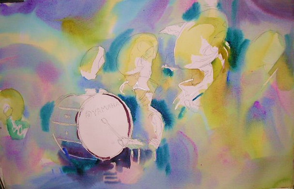
Repetitions of colors and shapes give unity to this painting of a marching band. Starting with the underpainting, I established the curvilinear strokes that were echoed in the circles of the bass drum and Sousaphones. Abstract backgrounds can come in aid of shapes, colors, and lines in the subject matter by repeating them.

So repeat after me....."I will repeat, I will repeat.."

Sunday, April 25, 2010

Being Expressive


This little drawbridge in Perkins Cove, Maine has always reminded me of a bridge in one of Van Gogh's paintings. The subject matter and the buildings in the background are so complicated that I didn't have a hope of literally reproducing them. My only option was to express my reaction to the busy scene.

My thinking was that color would help that goal, and that small shapes would create a lot of movement around the white bridge. Expressive color trumps grays and neutrals anytime you want to create a vibrant scene. If I had wanted to express a calm and quiet harbor, vivid colors are not the choice I would have made. Also, hard edges demand more attention than soft, wet-in-wet edges.

Expressive colors are invented and certainly not faithful to the local colors. But they can make for a more exciting painting than being literal to both the colors and the objects in the scene. Take a flying leap into expressive color and fall in love with color all over again!


Wednesday, April 21, 2010

The Painter's Friend

Side light ,along with the long shadows it produces, is the painter's best friend. Afternoon shadows often help the design and highlight the warm light of the late day.


Here is another in the town square series. This one is from a sketch I did of the Venetian Plaza at Epcot Village.

Tuesday, April 20, 2010

Going Negative


Sometimes watercolorists have to think like sculptors. Michaelangelo, when once asked how he could carve a figure out of a block of stone, said, "It's easy. I just carve away everything that is not the figure." In painting, that advice can come in handy. Instead of painting the subject, just paint everything that isn't the subject.

This technique is referred to as painting the negative space. In "Knickercane", study the tree trunk on the left of the mass of trees. After painting an initial wash, I carved out the tree and its branches by painting the space behind the tree.

This painting also helps illustrate problems with large masses of green. Study it for seeing the subtle changes in shades, tints and tones of greens. I never use a green straight from the tube.
I either warm it up or cool it down, trying to mix the colors on the paper to avoid muddying them.

Friday, April 16, 2010

I've Been Framed


A while back, I talked of the photographer's framing device: looking over, around or past something in the foreground. Often times, the framing device object becomes as important or more important than the object in the background.

Here is a painting I did on the estate of some friends of mine in Naples, Florida. I painted this little mermaid statue many times, and often framed it with the banana leaves on the shore.

(I did worry about coral snakes, so before I would back up to study the pattern, I would always scatter the foliage on the ground with a stick!)

This painting once again refers to my love of statuary and fountains.

Tuesday, April 13, 2010

Leaky Light


Last time I urged that painters look for ways to link their darks. This post, I want to remind you that lights should be connected, too. I've called this both "escape routes" and "leaky light."


In this painting, the light flowing across the beach hits the port side of the bow, so I've left the edge of the bow unpainted. Your eye fills in where the boat stops and the beach begins. That builds an interesting shape that a flat horizontal line could not accomplish.


"The Oystermen of Eastpoint" often meet where they launch their boats to discuss the last catch, the latest prices, or whether or not today would be a good day for fishing. Sometimes after thinking about going out for two hours, they'll decide to pack it in and wait 'til tomorrow. I imagine that's what the good ol' boys by the truck are doing. And if they've had to think about it this long, they're probably not going!

Thursday, April 8, 2010

Working In A Series


After I painted Franklin Town Square, I wanted to paint more town squares. I started with this very modified scene of the main street in Eufala, Alabama. I based it on the fountain, and for the sake of the painting, exaggerated the height of the buildings. There was a gazebo in the photo I took, but I didn't want it to compete with the fountain, so I reduced it to an umbrella.

You'll also notice that the bottom left edge of the fountain is blurred into the background. It is helpful to connect darks wherever posssible. That is the purpose of the dark figure in the foreground, too. Softening and gradating the hint of trees maintains the silhouette and creates a bit of mystery.

I'm going to look for other town squares to continue the series.

Tuesday, April 6, 2010

Request


Scipio Creek in Apalachicola harbors the local shrimp boats, so when I saw this tugboat, its color and height stood out.

Just curious....I'm wondering how many folks are reading my blog entries. So I have a request. Would you leave a reaction or comment for this entry? Even if you are a Follower, I'd like to get a sense for how many are regularly reading.

Thanks so much! Carol

Sunday, April 4, 2010

Obliques


Horizontal lines are restful, calm, and quiet. Vertical lines are formal and rather static. To get a feel of movement and tension, oblique lines work best.


Many people use the word diagonal instead of oblique. Diagonal lines cut things in half. An oblique line is any line that is slanted, whether it divides something in half or not.


The oblique line creates tension and therefore interest. In this painting of lobster traps, oil drums and buoys, oblique lines are everywhere. It is important that near the edges the oblique lines point into and not out of the painting. Shadows, objects, lines, and underpaintings can all provide opportunities for obliques to help circulate the eye through the painting.

Wednesday, March 31, 2010

Through the Looking Glass


Yesterday I spoke of locating source material to develop into paintings. Here is a sketch I found in one of my many sketchbooks, and the painting that resulted.


To give the feeling of being in the boatyard among the boats, I used boats on either side of the composition as framing devices. The one on the right leads the viewer into the painting, and the hull on the left stops the eye and keeps it on the focal area.


The dark cast shadows under the boats form a broken line which is always more intriguing than an unbroken straight line. Even in such a small shape, I keep in mind interlocking shapes. It has the advantage of implying all sorts of debris without having to detail the interior of the shape.


You may also want to study the many shapes that feature gradation of value and even subtle color changes.


Monday, March 29, 2010

Rumaging for Subject Matter


While looking through some of my old sketchbooks for something to paint, I came across this sketch of Stormy, the long-time engineer of the St. Louis Zoo train. Later I found a pastel that I had done from the sketch.


Not only does a sketchbook provide memories of a particular day or experience, it can provide you with subject ideas for paintings down the road.

I have a filing system for old photos, too. "Boats", "Architecture," "Farms," "Animals," "Trees," "Docks," etc. Sometimes I use one photo for the main subject and another photo for background material.

I also collect postcards of places I've visited. Be careful with this one; copying a composition is considered plagiarism. I use them primarily for one item in the picture: a building, figures, mountain shapes.

When I travel, I also look in antique stores for interesting items to include in still life paintings.

But the sketchbook is the thing. It is my own take on a scene or object that I had a reaction to and that is in my own "handwriting". My sketchbook is always in my car, along with a little makeup bag filled with pencils, markers, charcoal, and conte crayons.
When I am unable to get outdoors to paint on location, rumaging through these sources is a good way to get my creative juices flowing.

Sunday, March 28, 2010

Tree Clusters and Contrasts


One more entry on trees. In this scene, I was most interested in the clusters of trees, in particular the angular branches of the trees on the island. There, texture also becomes important, whereas the background trees become one continuous shape with no interior textures.


The other consideration was contrasting the color in the sky with the tree colors. By choosing a pinkish tint in the sky, I set up the complementary colors of red and green.


When setting out to paint trees, rather than thinking, "I am going to paint trees", I think, "I am going to paint interesting shapes with contrasting colors, values, and textures."

Friday, March 26, 2010

Tree T


Way back in one of my earlier entries, I spoke of the T as a compositional device. In this painting of a tree next to a stone wall in New England, the upside down T works to emphasize both subjects. Gradation in the wall shape, the trunk and the background shape helps lead to the focal area.


Notice, too, how the background trees are reduced to mere silhouettes in lighter and lighter values. This aids in subordinating them to the "star" tree.


Be careful as well not to outline rocks, bricks and stones. Paint their base color and then pick out the dark cast shadows.

Wednesday, March 24, 2010

For the Love of Trees


In one of my past lives, I must have been a Druid. I love being in the same space with trees.
The reflective calm that comes over me in a forest is hard to match in any other setting.


Once in one of my English classes, some students asked if I believed in heaven. I answered, "All I know is that if there aren't any trees there, I ain't goin'!" I'm sure the more literal ones among them were greatly concerned for my immortal destination, but I was trying to make a point about serenity and beauty.


" I think that I shall never see/ A poem lovely as a tree" may be corny poetry, but it certainly speaks to the power of trees to soothe the savage breast.


P. S. Sadly, this spot no longer exists. Some fool bought the land and bull-dozed the entire forest so he could build a starter castle that he uses a couple of months a year. Now whose soul should we worry about?

Monday, March 22, 2010

Tree Portraits


I love trees! Once in a while you'll find a tree that deserves to have its portrait done. I found this beauty in Apalachicola, Florida. It's in the front of a dentist's office, so when a woman stopped by to watch me paint, and she said, "Oh! You're painting the Doctor's Tree", I assumed she meant the dentist. "Oh, no," she said. "Back in the '20's, there was an old doc who took a dislike to this tree for some reason, and every time he got drunk, he would ram his Model T into the trunk!" I guess not everybody loves trees like I do.


Not only did I love the beautiful curves and angles of the branches of this live oak, but I liked the Resurrection Fern growing on the top of one of them. Resurrection Ferns can look like they've completely dried up and turned brown, but with the first sign of a shower, they rise up green as they can be. Come to think of it, a little like a frustrated painter!

Thursday, March 18, 2010

More Interlocking Shapes and Silhouettes


In this painting of the town square in Franklin, Tennessee, just south of Nashville, I was again very aware of the shape of the background buildings, which also determined the shape of the sky. The silhouette of the buildings interlocked with the sky in jig-saw style. I must confess to moving a few things in order to keep the roof line on the left side from being a boring straight line with no interrruptions, and therefore, no interlocking shape.


Also note that the colors and values run from warm darks in the foreground to cool lights in the distance to instill a feeling of receding objects. Without over-defining each separate building, the colors and shapes do the lion's share of the work. Overlapping the monument using small shapes of darks further accentuates the foreground and provides an aerial perspective to complement the linear perspective.


Silhouettes and gradation come in aid of an interesting shape. It doesn't take millions of details to give the feeling of a small city landscape. It just takes good solid values that overlap.

Tuesday, March 16, 2010

Backgrounds--Trees


A couple of entries ago, I spoke about the scariest color: red. But greens are also a trouble spot for many landscape painters.


One reason that greens are problematic is that it is so easy to end up with a dull, uniform muddy color. When painting a group of background trees, try to slip some warm and cool colors into the shape.


Also, don't forget that treelines in the distance interlock with the sky shape, so beware of the tree top lines so they don't become a straight line.


And finally, consider the possibility that the trees in the background don't come in aid of your painting. The greens may clash with the foreground colors or the values may box in the foreground shapes.


I painted this scene on location in New London, New Hampshire. After a couple of years of including the background trees and being frustrated with the result, I decided to omit them altogether. So this lesson on background trees is that in some cases it's better to just leave them out!

Saturday, March 13, 2010

Interlocking Shapes


One of the puzzling things for many beginning artists is what to do with the background. When they describe the problem to me, it seems they are more concerned about what to include in it or what colors to make it. I am more focused on making sure that the background shape interlocks with the foreground shape and that those shapes are interesting.

Interlocking shapes are like pieces of a jigsaw puzzle. They fit into each other. An example of two shapes not interlocking is a painting of the sky and the ocean meeting at an absolutely unbroken horizon line. The resulting two shapes would probably be two rectangles...very static and boring shapes.

Look for ways to break into any static lines to form shapes that interlock with each other.

In this painting of a tugboat (which is actually a restaurant in Boothbay Harbor), trace the outline of the tugboat with its stacks and the roofline, and you'll see that the background and sky also become a more interesting light shape.

Thursday, March 11, 2010

The Scariest Color


Of all the colors on my palette, red is the one that scares me the most. It is very aggressive and cannot be ignored. Even a small spot of red will draw the eye.


But red is a prominant color in Chinese ornamental architecture. In this scene of Chinatown, it appeared in most of the buildings. I decided to keep the entire painting in a warm color scheme, so I used orange in the underpainting, and since blue is its complement, threw in a bit of that as well.


The busy street scene needed lots of smaller shapes near the center to emphasize the activity. The banners and figures supply movement.


The purplish shadows share the red hue which is therefore compatible with the local color.


Don't shy away from colors that you normally avoid. Swing away with a loaded brush and see what happens!

Wednesday, March 10, 2010

The Art of Elimination


I love to paint on location but sometimes there is too much subject matter to include in one painting.
So how do we choose what to include and what to eliminate from our paintings?


1. Name the one subject that you want the viewer to focus on.
2. Name the area on the painting surface that you want to zero in on.


3. Think of textures in the background that can be eliminated.


4. Decide which background objects don't add to the focal area.


5. Choose some dominant colors, and subtract objects that don't fit the color scheme.

6. Or....Change the color of those objects.


7. Make the focal object fit into its surroundings.


I'm including the photo of the derelict that I painted on location so you can see the stuff I chose to eliminate. It seemed to me that a derelict should be in an isolated location, so I took out everything but the old boat and one palm tree.
When composing, eliminate anything that doesn't support the main actor!


Tuesday, March 9, 2010

A Local Sight


This is a local tradition----the Vegetable Boat. It makes the rounds of the islands around Boothbay Harbor, bringing fresh produce to islanders who must plan their mainland grocery visits carefully. The low sleek lines of this vessel appeal to me. So do the bushels of fiddleheads and other seasonal vegetables.


I'm back to painting after a long cold, rainy winter that prevented much outdoor painting.


I hope to share some new work with you very soon.

Sunday, March 7, 2010

Drawing


The day Ed Whitney taught his last class at the Pratt Institute, he left his students a simple message. High on the wall in huge letters he wrote the word DRAW. Then he drew a line down the wall, along the floor and up the opposite wall where he wrote: "Goodbye. Good Luck."


Whitney was a fine watercolorist and excellent painting instructor. The fact that he emphasized the importance of drawing in his last message to his students should drive home to all of us the need to constantly practice this most basic of artistic expressions.


A friend of mine is currently undergoing training to become a volunteer docent at the St. Louis Zoo, and it reminded me of some drawings I did there a while back. I remember everything about these days. Drawing and painting seem to heighten awareness of your surroundings, and intensify all five senses. So carry your sketchbook and become a sketch hunter.

Friday, March 5, 2010

Growth


I always tell students to save their old work in order to monitor their progress and growth. Changes in style, color choice, and looseness can readily be seen over a number of years.


If there is little change, that would also be informative.


Change for change's sake or a sudden style change chosen merely to impress critics or gallery owners can be seen not as an effort to explore possibilities, but rather as a strategy to garner attention. Better to evolve by studying your work and finding some aspect of it that you would like to push, to develop, to emphasize.


Here are two examples of my work. One is from twenty years ago, the other from last summer.


I have gradually decided not to slavishly replicate the colors of nature, but to choose a palette of brighter, purer colors. I think it's fairly obvious that I've also loosened up quite a bit. Edge quality has changed as well.


Anything else?

Thursday, March 4, 2010

Escape Routes


I also refer to this technique as "leaky light." The idea is to not box in shapes, but to connect them by letting passages of light flow from one area into another. The flow of light keeps edges from getting too hard, especially at the edges and bottoms of buildings, and also tends to direct the eye around the painting.


In this example, you can trace the path of light throughout the painting.

Wednesday, March 3, 2010

On the Road Again


Up very early to leave Apalachicola. Goodbye to Edda and Sportsman's Lodge and Eastpoint and the Gulf.


Up Hwy. 65. About ten miles south of Hosford, I came face to face with a small herd of long horned cattle ----half along side the road and half in the roadway! I could see the open gate where they had wandered out. Time for a round-up!


One highlight of the trip was the town of Eufala, Alabama. Wonderful Main Street, fountains, lovely old mansions with live oaks shading everything.


And since Alabama and Georgia are peanut states, this cute little sculpture celebrating the National Peanut Festival caught my eye at a rest stop just inside the border.


Finally I arrived in Dadeville for an all too brief visit with friends Linda and Monty. Linda drove with me up here to Alexander City and Monty joined us later for dinner at Ruby Tuesday. I'll see them again in July in Boothbay Harbor.
So no painting today. I'll be back home Friday afternoon, so revisit my blogsite after then!


Saturday, February 27, 2010

Avoiding the Cliche


On the eastside of Boothbay Harbor, the Catholic Church stands sentinel over the town. It has been painted countless times from countless angles. Avoiding the cliche becomes more difficult with each attempt.


Once I painted it while some steeplejacks were painting the steeple. Ropes, ladders, painters and buckets all animated the scene. In this case, I changed the attitude toward the subject. It was definitely not Sunday morning!
Color choices will also affect the perception of a well known subject.


Sometimes trying to avoid a trite presentation will force you to try a completely different approach in style. Here are two paintings in which I was experimenting with color and style. I thought the veils of color in the second painting would suggest a kind of spirituality that a more realistic sky couldn't accomplish, so I had to get inventive. Eventually that led me to apply the things I learned to other subjects.

Thursday, February 25, 2010

The Oh-So-Not-Trite Subject


In July of 2008, the Washburn-Doughty Shipyard in East Boothbay, Maine was engulfed by fire which for a while even threatened the whole village. It was such a complete disaster that it made the national news. The next day the ruins were still smoldering when I decided to document the biggest historical event that had happened in town since WWII.


I had painted their buildings so often that I felt compelled to paint them one last time. The tangled wreckage was conveniently composed of the complementary colors blue and orange. Everyone was talking about the haunting stairway to nowhere and the remains of two sea-going tugs that were being constructed on the property, so I moved them closer together in the painting. I think I captured the essence of the conflagration's aftermath.


As I've said before, sometimes you paint things because you must, not because they're saleable. You can paint anything if you want to....no subjects should be off limit.

Wednesday, February 24, 2010

Trite Subjects


Barns, covered bridges, irises, and, yes, lighthouses can all be such favored subjects that if something doesn't distinguish them from the thousands of others that viewers have seen, the painting can be so predictable that even if it is accurately rendered, there maybe a ho-hum factor. It could be strong colors, a very loose, painterly treatment, an unusual vantage point, an interesting framing device or a fragmentation of the subject that give the subject new energy.


I once saw a very clever painting of the Missouri State Capitol off in the distance, seen through the openings in an old barn which took up most of the perimeter of the painting. It gave a new twist on both the capitol building and the barn.


Here is my take on the lighthouse at Pemaquid Point, Maine.

Monday, February 22, 2010

Dominance - Something Has To Win


I don't know if it was totally original with him, but Skip Lawrence used to tell his students that "something has to win," be it a color, a shape, texture or subject. If everything has equal weight, nothing wins, and the viewer won't know what you want him to focus on.


If you are painting a boathouse, make it the dominant sized shape in the rectangle. How is the viewer to know that the building is your subject if it is smaller, or equal sized to every other object in the painting? Make the building fill the majority of the space.


The same thing is true of a landscape. If you want the land and the objects on it to be your subject, it has to occupy the majority of the space. If you want the sky to be your focal area, it has to "win" the space contest.


So here's a painting I did of the Spanish Pavillion in Forest Park in St. Louis. What do you think?....Is it the land or the sky that is the focal point? Based on what compositional decision?


Saturday, February 20, 2010

Out and About


Well, I'm on the road again. Here in Homosassa, I met up with some old friends who now live in Virginia. They caught me painting on the side of the road, and then we drove over to the resort.


Next we went to Homosassa Springs State Park where we viewed the manatees and all sorts of birds, alligators, even a hippo.


At least I have a strong signal here at the resort. So here's one last street scene in Apalachicola.


Tomorrow, Kissimmee!

Sunday, February 14, 2010

Grouping


The figure eight lesson has proved popular so here is another boat painting. Grouping similar objects, either by overlapping or connecting their shadows is a good way of emphasizing your subject matter. Plus, you rarely find one boat isolated from others. If you do, for instance in a photograph, just move them around a bit in your composition so they are touching or overlapping is some way.


Remember also, the rule of thumb in multiple repeats is to try for an odd number---3 or 5--so that you don't get stuck with symmetrical balance.


Wednesday, February 10, 2010

More Boats


I thought you'd like to see some paintings of boats to illustrate yesterday's drawing lesson.


I love tug boats, lobster boats, oyster boats and shrimp boats, so it is important that they be drawn correctly.


Another problem with painting boats is that they curve both from bow to stern and from the deck to the water line, thus going into shadows from both directions. Remember to soften the edges of the shadows because they are not cast shadows.
First, a simple rowboat.

Tuesday, February 9, 2010

Figure Eight Boats


Drawing boats is hard for many people, so here's an old trick I learned years ago to simplify the mystery.


Draw a skinny figure eight lying on its side, or an infinity sign. Make one of the loops larger than the other. Find the apex of the larger loop and draw an oblique line downward. This will be the bow.


Then draw a more or less straight line from the bow to about the 7/8 mark. At that point, swing the line upward to the back of the smaller loop. Go straight across to the other side of the loop. Then follow the figure eight line to the the first line.


On the other side of the bow follow the figure eight until it begins to curve back. Draw a second line downward.


To add a cabin, just draw a cube. In the case of a shrimp boat it will probably have a rounded hood that you can add.

I hope the drawings will illustrate the process.


Thanks to the members of the Carrabelle Art Association for inviting me over to do a demo for them today. What a friendly group you are! I hope to come back again real soon!


Sunday, February 7, 2010

Receding Textures


Hendrick's Head Lighthouse is situated on this point with its popular beach. Most painters in the area, including me, have painted it numerous times. The challenge becomes finding new ways to paint a familiar site.


I chose to ignore the lighthouse on this trip and focus solely on the beach with its flotsam and jetsam at the high tide line. To give the painting some animation, I included a dog that was a ubiquitous sight there. Champ has been gone for twenty years, but I still like to have him around in my paintings.


Most painters know that as colors recede into the distance, they get grayer and cooler. But textures also tend to disappear as they get farther from the foreground. In "Champ", look at the debris on the beach and some of the foreground rocks, and you'll see that by the time you get to the retaining wall, individual rocks have melted into one shape with little or no texture. The colors on the wall are also a mixture of warm and cool grays.


Textures are usually prominent where the eyes focus, but peripherally, textures tend to soften and disappear. When textures are everywhere, the viewer doesn't know where to look, so choose their placement wisely.
Wednesday, February 3, 2010

Unity


Unity implies that if you clipped out any section of a painting and positioned it anywhere else in the painting, it would still look like it came from that painting. You couldn't clip out a piece of any Rembrandt painting and put it into a Jackson Pollock drip painting and get a feeling of unity.


So what gives a work a sense of unity? A theme could be established by a unifying geometric shape. Mondrian comes to mind. A painting which is dark on one side of the canvas and high key on the other would not have a sense of commonality. But a painting which is composed of primarily dark values would have unity. A common repeated color can also give a painting the sense of relatedness and thus, unity.


In this painting of a wharf scene, the same colors can be found all over the page. If a bright red shape were inserted into all these pastels, unity would be destroyed.

Sunday, January 31, 2010

From Sketch to Painting


Keeping a sketchbook handy is a habit that can aid the painting process. It's the place where I work out many of the kinks before I get my brushes out. Sketching is like brainstorming. Values, placement, size, lighting, and elimination of unnecessary elements are worked out ahead of time.


A sketch is not a drawing. Drawing strives for accuracy of line and many times details that don't necessarily involve compositional considerations. A sketch is looser and freer than a drawing and is not concerned with being a finished work of art. It is a plan of action.


Here is the sketch and the resulting painting of the lighthouse in Rockland, Maine.


Thursday, January 28, 2010

Painting Through


I love to paint the shrimp boats over at Scipio Creek where the fleet is harbored. The booms, wires, gears and nets that form a lacy pattern against the lighter background attracts my eye every time. Today I painted the building which houses the estuary research facility.
When painting the sky, paint through any areas that will eventually be darker. (The exception is if that midtone is going to be warmer and you don't want it influenced by the cool sky tones.)


When painting a midtone shape, be aware of subtle color changes and creating an interesting shape. Paint through all the areas that will eventually be darker. For instance, the building was once all one value. When it was dry, I came back in with the darker shadows. These darks must be bold enough so you don't have to go back over them again. Paint through all the rigging that will eventually be even darker. Find the major struts and bars that do the hauling, and you can then be a little more flexible and inventive with the rest of the lines and wires. Then load the brush with lots of paint and little water to make the darkest lines in the composition.


Paint through areas that will eventually be darker. Don't stop at the line where a darker shape will be or you'll get a halo effect that will look unnatural. Knowing ahead of time where your lights, midtones and darks will be will allows you to paint through those areas that will later be darks.

Wednesday, January 27, 2010

Apalachicola


I've been in Apalachicola for over four weeks but it's been so windy, cold, rainy and foggy, that not many paintings have gotten done. Yesterday I tried to paint in a fierce wind, and the easel kept threatening to blow over so I spent more time grabbing for it than I did painting!


But today was sunny and nearly windless. I decided to try a street scene so you could see one of the main corners in the historic little town. The building in the distance is an old armory. I simplified its shape to a silhouette, and then overlapped it with the darker shapes of the foreground buildings. Figures help make it look like it's not a ghost town.


See shapes before you see details within the shape. Keep any details in the distance to a minimum. The viewer, who is not standing in front of the scene, will not miss them.

Monday, January 25, 2010

Re-Interpreting an Old Subject


Here's one last painting in the Wharf Life Series. This time the focus shifts to the area under the pier. I even invented a floating dock that wasn't there. Again strong color plays an important role and there is an overall checkerboard pattern. I'm also including the first painting in the series to show the evolution in style.